Glossary
.svg)
.avif)
Search Terms in Design, Development, & Marketing
.svg)
Interaction design is all about how users engage with a product: taps, swipes, clicks, transitions. It focuses on feedback, responsiveness, and making interfaces feel intuitive.
An internal link connects one page on your site to another. It helps users navigate, keeps them engaged longer, and improves SEO by passing authority across your content. Glossaries like this are internal-link goldmines.
Iterative design is the process of launching, learning, and refining—repeating this cycle based on user feedback and performance data. It’s the foundation of modern UX and avoids the trap of designing everything “perfectly” the first time.
JavaScript is a scripting language that brings websites to life. Think interactive elements, animations, form validation, and dynamic content. In Webflow, you can add custom JavaScript for more advanced functionality beyond the native tools.
Journey mapping is a UX exercise that visualizes the steps a user takes to achieve a goal like signing up, making a purchase, or solving a problem. It helps teams spot pain points, emotional highs/lows, and opportunities to improve the experience.
JSON-LD is a format used to add structured data (like Schema Markup) to a website. It helps search engines understand your content and can improve visibility in search results with things like rich snippets.
Kerning is the space between individual letters in a word. Good kerning improves readability and gives your typography a polished, intentional feel. Too much or too little space can make even the best font look off.
Keyword cannibalization happens when multiple pages on your site target the same keyword, causing them to compete against each other in search rankings. It confuses search engines and can dilute your visibility. A solid content strategy helps prevent this.
Keyword density refers to how often a keyword appears on a page relative to the total word count. While it used to be a big deal in SEO, today it’s more important to write naturally and focus on user intent, not hitting a percentage.
KPIs are measurable goals that track the success of your design or marketing work, like conversion rate, page speed, bounce rate, or engagement. Choosing the right KPIs keeps your team aligned and focused on outcomes, not just outputs.
A landing page is a standalone page built around a single goal, like capturing leads, promoting an offer, or getting signups. It’s often stripped of distractions (like site-wide nav) to keep users focused on converting.
LCP measures how long it takes the main content on your page to load—usually a hero image or large heading. It’s a Core Web Vitals metric that directly impacts perceived speed and SEO. Google recommends keeping LCP under 2.5 seconds.
Lazy loading delays the loading of images or other resources until they’re about to enter the viewport. It helps improve performance, especially on long-scroll pages. Webflow includes built-in lazy loading for images by default.
Line height controls the vertical spacing between lines of text. Too tight, and it’s hard to read; too loose, and it looks disconnected. A line height of 1.4 – 1.6× the font size is usually a safe, readable range.
llms.txt is an emerging web standard designed to help website owners control how their content is accessed and used by large language models (LLMs) like ChatGPT or Claude. Inspired by robots.txt, this file specifies whether AI crawlers can scrape your content—and under what conditions.
As AI agents increasingly reference website content in answers, llms.txt helps protect IP, manage attribution, and signal AI-readiness to future search systems.
We break it all down in our step-by-step guide, llms.txt Beyond Permissions: Helping AI Understand Your Website.
Load time is how long it takes your page to fully render in a browser. Faster load times mean better UX and higher search rankings. Optimize by compressing images, reducing JavaScript, and using clean, semantic code.
A long-tail keyword is a highly specific search phrase, often with lower competition and higher conversion intent, like “Webflow agency for SaaS startups” instead of just “web design.” Glossaries like this one help capture those long-tail search terms.
Low-code and no-code platforms let teams build websites, apps, and automations without traditional coding. Low-code tools (like Bubble or OutSystems) may require some scripting; no-code tools (like Webflow or Zapier) use visual interfaces entirely.
These platforms speed up development, reduce technical bottlenecks, and empower designers, marketers, and founders to ship faster. Webflow sits squarely in the no-code category—while still offering full HTML/CSS/JS flexibility when needed.
Read When Should You Use Low-code App Development for more.
Both margins and padding create space, but in different ways:
Padding adds space inside an element, between the content and its border.
Margin adds space outside the element, separating it from other elements.
Understanding this distinction is crucial for clean, consistent layouts, especially in responsive design.
Read our post Responsive vs. Adaptive Design in 2025: What You Need to Know for more information.
A meta description is the short blurb that appears below your page title in search results. While it doesn’t directly affect rankings, it can influence click-through rates. Keep it clear, concise (under 160 characters), and action-oriented.
Microcopy is the small bits of text that guide users, like button labels, form hints, or error messages. Done well, it improves clarity, reduces confusion, and builds trust. It’s the “invisible” UX that makes everything smoother.
Microinteractions are subtle animations or responses triggered by user actions, like toggling a switch, submitting a form, or liking a post. They provide feedback, enhance usability, and add personality to your interface.
Mobile-first design means designing for the smallest screen first, then scaling up for larger ones. It ensures essential content stays prioritized and helps teams avoid bloated desktop layouts that don’t translate to mobile.
Modular design breaks pages into reusable blocks, like testimonials, product cards, or CTAs. It speeds up builds, ensures consistency, and makes content easier to manage. In Webflow, this often means designing with Symbols or Component Libraries.
Read our post The Modular Homepage: How Scalable Layouts Future-Proof Your Brand for a deeper look.
Motion design uses animation to support UX by guiding attention, showing progress, or reinforcing actions. From hover effects to scroll-based reveals, it makes digital experiences feel more fluid and engaging.
Curious how motion enhances engagement? Check out our blog: From Static to Strategic: How Motion Design Elevates UX in Webflow.
Multivariate testing tests multiple elements (like headlines, buttons, and images) in combination to see which mix performs best. It’s more complex than A/B testing, but can yield deeper insights—especially for high-traffic pages.
A navigation menu helps users move through your site. It can be a top nav bar, sidebar, hamburger menu, or sticky header—just make sure it’s clear, intuitive, and easy to use across devices. Great nav = lower bounce rates.
NPS measures how likely users are to recommend your product or service on a scale of 0–10. It’s a quick way to gauge customer satisfaction, but should be paired with qualitative feedback to get the full story.
In tools like Figma, Webflow interactions, or animation libraries, a node refers to a single element or point in a network—like a shape, frame, or trigger. Nodes connect visually or through code to control behavior or layout.
A noindex tag tells search engines not to include a page in search results. Use it for pages you don’t want indexed—like internal admin dashboards, duplicate pages, or staging environments. Just don’t forget to remove it when you go live!
Notification UX focuses on how alerts, messages, or prompts appear in your product. Whether it's a banner, toast, or modal, timing and clarity are key, especially for error states, confirmations, or onboarding tips.
An off-canvas menu is a navigation panel that slides in from the side of the screen, often triggered by a hamburger icon. It’s a popular mobile pattern that keeps the main layout clean while still offering full navigation access.
Onboarding UX guides users through the first steps of using your product or site, like welcome messages, tutorials, or tooltips. A smooth onboarding experience improves activation, reduces drop-off, and sets the tone for long-term engagement.
On-page SEO refers to the elements on your site that impact search rankings, like page titles, meta descriptions, headings, internal links, and image alt text. It’s the foundation of search visibility and works best when paired with great UX and fast performance.
Open Graph (OG) tags are snippets of code that control how your content appears when shared on social platforms—like title, description, and preview image. Setting OG tags ensures your site looks polished on Twitter, LinkedIn, and beyond.
Organic traffic refers to visitors who land on your site from unpaid search engine results. Unlike paid traffic (ads), organic visits come from strong SEO, valuable content, and site performance—all things that build trust over time.
Page speed is how quickly your content loads for users. It affects SEO, bounce rates, and overall user satisfaction. Tools like Google PageSpeed Insights or Lighthouse help you measure and improve it by optimizing images, reducing scripts, and minimizing layout shifts.
Pagination breaks up long lists or collections into multiple pages (like blog archives or search results). It helps with performance and usability, but be sure to pair it with clear navigation and internal linking for SEO.
Parallax scrolling is a design technique where background elements move slower than foreground ones, creating a layered, 3D-like effect as you scroll. It’s great for storytelling pages, but should be used sparingly to avoid motion fatigue or performance hits.
A persona is a fictional character based on real user data. It represents a segment of your audience and includes traits like goals, frustrations, behaviors, and motivations. Personas help align design decisions with real user needs.
Pixel density refers to how many pixels are packed into a screen (measured in PPI or DPI). Higher pixel density (like on Retina displays) means sharper visuals, but also means you’ll need higher-resolution images for crisp design.
A plugin is a software add-on that adds extra features to a platform, like SEO tools in WordPress or analytics integrations in Webflow. Too many plugins can slow down your site or introduce security risks, so be selective.
Progressive disclosure means showing only the essential information up front, and revealing more as needed. It keeps interfaces clean and avoids overwhelming users, especially in forms, dashboards, or onboarding flows.
A PWA is a type of web app that behaves like a native app, offering offline access, faster load times, and the option to “install” it on a device. It bridges the gap between web and mobile without needing an app store.
A prompt zone is a user interface area specifically designed for entering or selecting prompts—typically for AI-powered tools like chatbots, content generators, or search assistants. It can be as simple as a text input field or as advanced as a multi-modal prompt composer with filters, templates, or voice controls.
Good prompt zones are:
- Clear in their intent (“What do you want to generate?”)
- Flexible for structured or freeform input
- Visually distinct from output areas
- Often paired with auto-suggestions or prompt history
As prompt-driven experiences become more common, the design of prompt zones plays a key role in usability and trust.
Read our post What Is a Prompt Zone? Designing Interfaces for AI Co-Pilots for a deeper look.
A prototype is an early, interactive version of a product used to test ideas before final development. It can be low-fidelity (like wireframes) or high-fidelity (with animation and interaction). Tools like Figma make prototyping fast and collaborative.
For more information on Prototyping, read our post How to Wireframe and Prototype Like a UX Strategist.
Quality Score is a metric used by Google Ads to evaluate the relevance of your ad, keywords, and landing page. A higher score means lower cost-per-click and better placement. While it’s mostly used in PPC, it reflects good UX principles: speed, clarity, and relevance.
Query parameters are values added to the end of a URL, usually after a ? to pass information to a page. Example:
/products?category=shoes&color=blue
They’re often used for filtering, tracking, or dynamic content. Just keep URLs clean and avoid over-indexing pages with duplicate content.
React is a popular JavaScript library for building user interfaces, especially for complex web apps. It's fast, modular, and used by companies like Meta, Netflix, and Airbnb. While powerful, React requires a dev team—many companies migrate to Webflow for more visual control without sacrificing interactivity.
Migrating your site from React to Webflow? Check out our React to Webflow migration guide.
Responsive design ensures your website adapts to any screen size: desktop, tablet, or mobile. It uses flexible layouts, breakpoints, and relative units (like % or rem) so your content looks great everywhere. It’s standard practice and essential for both UX and SEO.
Retargeting is a digital marketing strategy that shows ads to people who’ve already visited your site. It’s done by using cookies or tracking pixels, and it helps re-engage users who didn’t convert the first time.
Rich snippets are enhanced search results that show extra info, like ratings, FAQs, or product availability. They come from structured data like schema markup and can help boost click-through rates by making your listings more eye-catching.
A roadmap is a high-level visual plan that outlines future product, design, or content updates. It helps teams prioritize work and communicate what's coming next—internally and externally.
The robots.txt file is a simple text file placed at the root of your website that tells search engine crawlers which pages or directories they’re allowed to access. It’s part of the Robots Exclusion Protocol and is crucial for managing crawl budgets, protecting sensitive content, and avoiding indexing duplicate or irrelevant pages.
Learn how to set it up correctly in our guide: How to Use robots.txt: The Original Way to Tell Crawlers What to Do.
ROI measures the value you get from an investment like ad spend, design work, or SEO strategy. It’s usually calculated as (gain – cost) ÷ cost × 100. Good design should drive ROI by improving conversions, engagement, and customer loyalty.
SaaS products are cloud-based tools accessed via subscription like Figma, Notion, or Webflow. Instead of installing software locally, users log in via browser. SaaS design focuses on usability, onboarding, and retention across recurring user sessions.
Schema markup is a form of microdata added to your site’s code to help search engines understand your content. It powers rich results like star ratings, FAQs, and event details. We use JSON-LD format for structured data, especially for blog posts, case studies, and services.
Want to learn how to use it in practice? Read our guide, Schema Markip 101: Make Your Site Machine-Readable for SEO and AI Agents.
Scroll depth measures how far down a page users scroll. It’s a useful engagement metric—if people don’t reach your CTA or footer, it may be time to rethink layout, content length, or pacing.
SEO is the practice of improving your website’s visibility in search engines. It includes on-page elements (like meta tags and internal links), performance (like page speed), and content strategy. Good SEO brings in traffic without paying for ads.
Read our guide on technical SEO in Webflow for an in-depth look.
The SERP is what you see after typing a search into Google. It includes organic results, ads, and sometimes rich snippets. The goal of SEO? Rank as high as possible on the SERP and stand out.
Session replay tools (like Hotjar or Microsoft Clarity) let you watch recordings of real user sessions on your site. It’s a powerful way to spot friction points, bugs, or confusing layouts, especially when paired with heatmaps and analytics.
Shopify is a popular e-commerce platform known for fast setup and ease of use. While great for online stores, some teams move to Webflow for more visual control, design flexibility, and integrated CMS content beyond products.
Interested in integrating Shopify with Webflow? Check out our Shopify integration guide.
A sitemap is a file or visual map that lists all the pages on your site. There are two types:
XML sitemaps help search engines crawl your site.
Visual sitemaps help humans (and teams) plan structure and hierarchy.
Skeleton screens are placeholder shapes that appear while content is loading. They make your site feel faster by giving users a visual cue that something’s happening, even before data has loaded.
Squarespace is a visual website builder with built-in templates and hosting. It’s user-friendly for small businesses and creatives, but limited in CMS flexibility and SEO customization. Many teams migrate to Webflow for more scalable control.
Migrating your site from Squarespace to Webflow? Check out our Squarespace to Webflow migration guide.
A sticky header stays fixed at the top of the screen as users scroll. It keeps navigation accessible but can take up valuable screen space if overdone. Use it for key pages or actions (like checkout, nav, or search).
A style guide defines the visual rules for a brand like typography, color, spacing, and imagery. In Webflow, style guides often live on a hidden “style” page for easy reference and consistent design.
Tags are labels used to group content, especially in blogs or CMS collections. In SEO, they help with content discoverability and internal linking. Just avoid creating dozens of thin tag pages with no real content.
Theming refers to applying consistent visual styles across an interface, like light/dark modes, seasonal looks, or brand variations. A good design system makes it easy to swap themes without rewriting every component.
Time on page is how long a user stays on a specific page. High time-on-page can mean strong content, smooth UX, or engaged readers. Just remember—it doesn’t track time on the final page of a session, so it’s not always a full picture.
A tooltip is a small popup that appears when you hover or focus on an element, often used for extra context, definitions, or explanations. Keep them short, clear, and dismissible for the best UX.
Touch targets are the tappable areas on mobile interfaces, like buttons or links. To meet accessibility guidelines, they should be at least 44 x 44 pixels. If it’s too small to tap with a thumb, it’s too small, period.
Typography is the design and arrangement of text: fonts, sizes, spacing, line height, and hierarchy. Good typography improves readability and user experience across screens. A strong type scale is foundational in any design system.
UI refers to the visual elements users interact with: buttons, menus, icons, input fields, etc. A clean, intuitive UI makes navigating a site effortless. It's the "look and feel" side of the broader UX equation.
“Unbounce rate” isn’t a standard metric, but it’s used informally to describe the opposite of bounce rate—when a user does engage by clicking another page or CTA. It reflects deeper interaction and intent.
*Note: This is an uncommon term, but sometimes used.
Usability testing involves observing real users as they try to complete tasks on your site. It helps uncover pain points, confusing flows, or design gaps, and is one of the fastest ways to improve UX before launch.
User-centered design is a design philosophy that puts the user’s needs, goals, and feedback at the core of every decision. It’s iterative, research-driven, and focused on building intuitive, accessible experiences that actually solve problems.
A user flow is the path someone takes to complete a task, like booking a demo, checking out, or reading an article. Mapping user flows helps you identify friction, optimize layout, and streamline interactions.
User Experience (UX) is how someone feels when interacting with your website or product. It’s shaped by usability, layout, clarity, speed, accessibility, and how easily a person can achieve their goal.
Good UX reduces friction, builds trust, and creates memorable digital experiences.
But UX is evolving. Today, your site isn’t just being used by humans—it’s being read, interpreted, and summarized by AI agents too. That’s where AX (Agent Experience) comes in: the new layer of UX focused on designing for both people and machines.
Explore how UX and AX now go hand-in-hand in our article Credibility in the Age of AI: Where SEO, AEO, UX, and AX Converge.
A variable font contains multiple weights and styles in a single font file, like regular, bold, italic, condensed, etc. This improves performance (fewer files to load) and gives designers more flexibility when customizing typography across breakpoints.
The viewport is the visible area of a web page in a user’s browser window. It changes based on device size, which is why responsive design is so important. CSS units like VW (viewport width) and VH (viewport height) let you size elements relative to the screen.
Visual hierarchy is how you guide the viewer’s eye through a page using size, contrast, color, spacing, and layout. Headlines should stand out, CTAs should pop, and content should be easy to scan. Great hierarchy = less cognitive load.
Read our post Design That Speaks Loudest: How Visual Hierarchy Shapes UX for a deeper look.
Voice UI (user interface) lets users interact with digital systems via spoken commands: think Alexa, Siri, or voice search. It’s part of a growing trend toward hands-free accessibility and multimodal experiences, especially in mobile and smart devices.
VR UX focuses on the unique challenges of designing user experiences in virtual reality environments. It involves 3D space, spatial audio, motion control, and physical feedback—all aimed at keeping interactions intuitive and immersive.
Web accessibility means building websites that everyone can use—regardless of disability, device, or context. It includes alt text, semantic HTML, keyboard navigation, and proper color contrast. It’s good UX, often a legal requirement, and always the right thing to do.
In many regions (including the U.S.), public-facing websites are expected to follow standards like WCAG 2.1 to ensure digital content is perceivable, operable, understandable, and robust. In the U.S., we follow:
The Americans with Disabilities Act (ADA) applies to public-facing websites, especially for businesses and institutions.
Section 508 of the Rehabilitation Act requires federal agencies and contractors to make electronic content accessible.
It boosts SEO, too
Accessible design is also SEO-friendly—search engines love structured, readable content, fast load times, and mobile-friendly layouts.
Webflow is a visual development platform that combines design, CMS, and hosting in one tool. It gives designers control over layout, interactions, and content without relying on devs, while still producing clean, production-ready code.
Curious what Webflow can really do? Explore our page Why Webflow for a deeper look.
WebP is a modern image format that compresses files smaller than JPEG or PNG—without losing quality. It helps improve load times and is supported by most major browsers. Webflow supports WebP for optimized image delivery.
White space (aka negative space) is the empty space between elements in a design. It gives your layout breathing room, improves readability, and helps guide attention. Don’t fear the blank—it’s a powerful design tool!
A widget is a small interactive component embedded into a webpage, like chat boxes, calendars, or social feeds. Just be careful: too many third-party widgets can slow down your site or clutter your design.
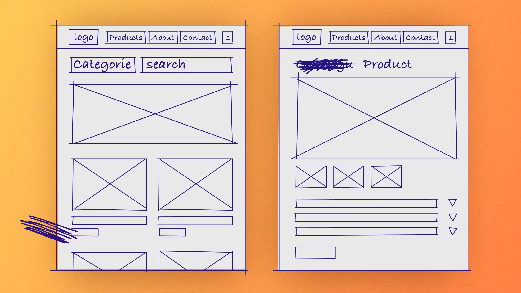
A wireframe is a basic blueprint of a page layout—usually black and white, without color or images. It maps out structure, hierarchy, and functionality before visual design begins. Think of it as a sketch for your site’s skeleton.
For more information on wireframing, read our post How to Wireframe and Prototype Like a UX Strategist.
WooCommerce is an open-source e-commerce plugin for WordPress. It’s flexible but dev-heavy, and often requires regular plugin maintenance. Many store owners switch to Webflow for a more visual, design-led e-commerce experience.
WordPress is one of the most widely used content management systems. It’s open-source and highly customizable, but can become complex with plugins, themes, and security upkeep. Teams often migrate to Webflow for a more streamlined, low-maintenance workflow.
Migrating your site from WordPress to Webflow? Check out our WordPress to Webflow migration guide.
In web and UI design, the X-axis refers to horizontal positioning: left to right. It’s commonly used when animating slide-ins, aligning elements in grids, or creating horizontally scrolling content.
In typography, x-height is the height of lowercase letters (like “x”) relative to uppercase letters. It affects readability and the visual balance of type on screen, especially in body text.
An XML sitemap is a file that lists all the URLs on your site, helping search engines discover and crawl your content. It's especially useful for larger sites and is often submitted directly to tools like Google Search Console.
In web design and development, the Y-axis refers to vertical positioning. Animations, layout spacing, and scroll effects often rely on Y-axis movement to guide user attention or create dynamic experiences.
Z-index controls the stacking order of elements on a web page. Higher numbers sit “on top” of lower ones—useful for modals, sticky navs, or any overlapping elements. In Webflow, z-index can be adjusted visually, but it’s still helpful to understand how it behaves under the hood.
The Z-pattern is a scanning pattern users often follow on simple layouts: left to right across the top, diagonally down, then left to right again. It’s commonly used in landing pages where a strong visual hierarchy leads users toward a CTA.
Recent News
.svg)


.avif)


.avif)

.avif)


Ready to take the next step?