Your homepage isn’t just a front door, it’s your brand’s elevator pitch, conversion path, and trust builder all rolled into one. It sets the tone for your user experience and influences how users move through the rest of your site.
But great homepage design isn’t about flashy visuals or trends. It’s about using UX principles, content strategy, and smart structure to make every pixel do its job.
Here are some key elements we focus on when designing high-performing homepages:
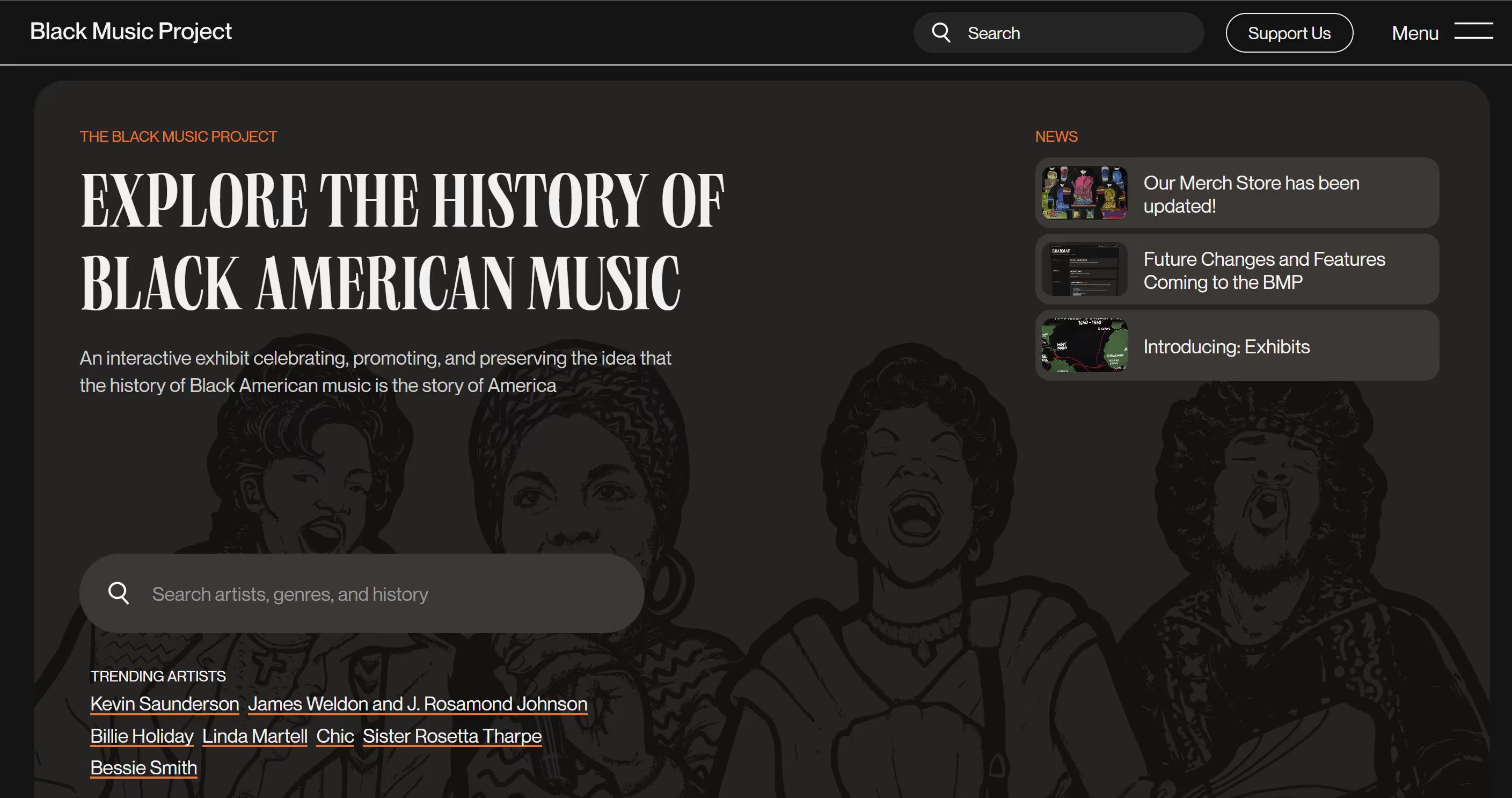
Designing Above the Fold: Make It Count
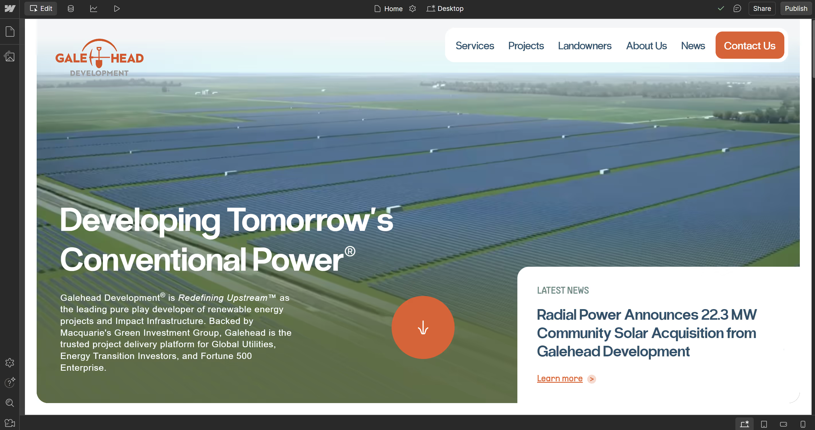
“Above the fold” refers to what users see on their screen before they scroll. You only get one chance to make a first impression, and it usually happens here.
According to a Nielsen Norman study, users spend 57% of their viewing time above the fold. So this space needs to communicate your value proposition fast.
We typically include:
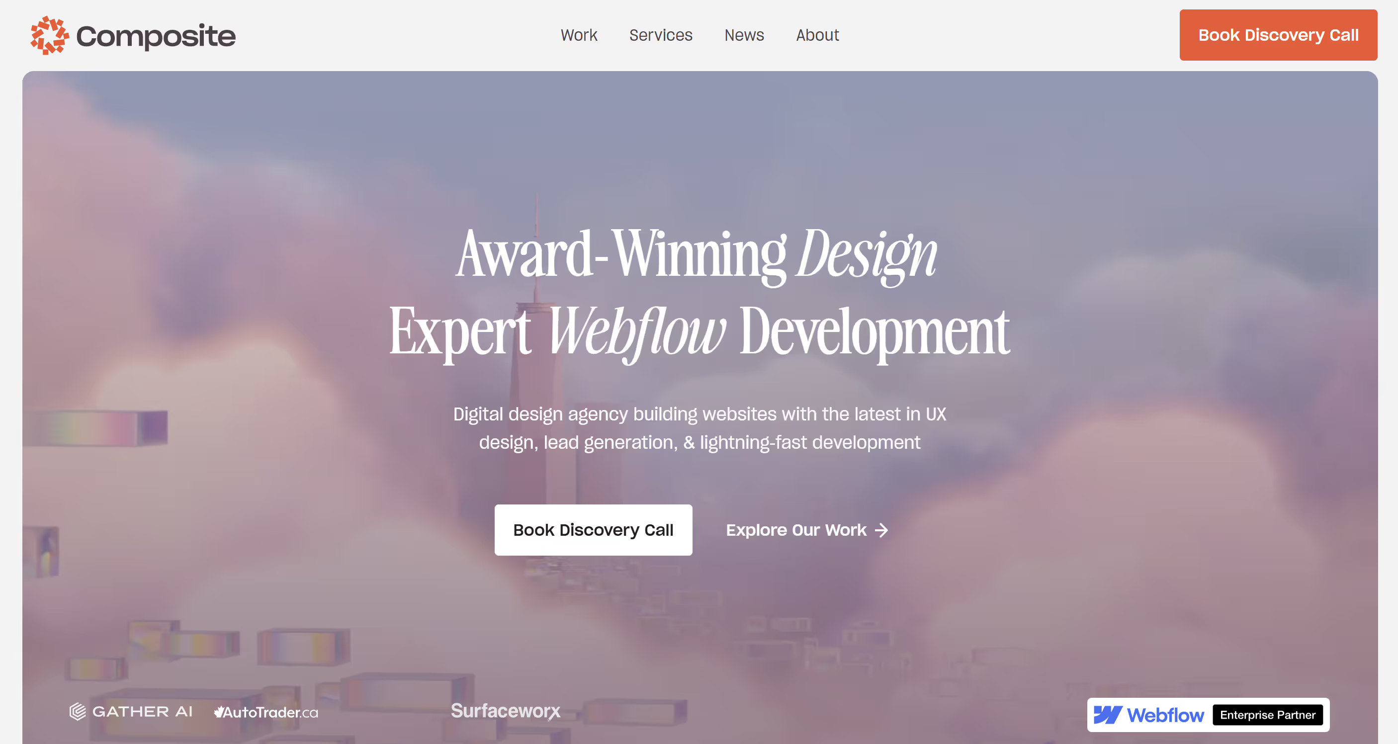
- A clear headline (what you do and who it’s for)
- A supporting statement or subhead (why it matters)
- A primary call to action (CTA)
- Strong visual hierarchy that draws the eye to the CTA
For a deeper look, read our post What Goes Above the Fold Matters: Capture Attention in 5 Seconds.
Your Hero Section Is Not a Billboard
Your hero section isn’t just a big pretty picture, it’s your storytelling hook. We design hero areas to balance clarity and emotion. That means:
- Messaging that speaks directly to user needs
- Clean, legible type (no edgy fonts just for aesthetics)
- Supporting animation or interaction that adds value, not distraction
We often test variations here using Webflow’s visual editor so clients can see how messaging shifts impact engagement in real-time.
Content Hierarchy Over Carousels
A homepage shouldn’t try to say everything at once. Instead of overwhelming visitors with endless sliders or six CTAs, we focus on content hierarchy.
Think of your homepage as a guided tour. Each section should:
- Answer a specific user question (“What do you do?” → “Why should I trust you?” → “What should I do next?”)
- Build trust through testimonials, logos, or data
- Reinforce your brand personality through tone and visual style
Design for Scanability
Most people won’t read your homepage, they’ll scan it. We break up content with:
- Short headlines and subheadings
- Icons or imagery to reinforce points
- Consistent layout patterns that guide the eye
This is where design and content meet. We collaborate with copywriters to make sure every line can be understood easily.
Responsive Design Isn’t Optional
Every homepage we build is fully responsive, and we plan for that from the wireframe stage. That means:
- Testing copy length on mobile breakpoints
- Adjusting layout and spacing for thumb reach
- Prioritizing what gets shown or hidden on smaller screens
Responsive design ensures that your message doesn’t just look good, but it lands the same way on every device.
The Homepage’s Secret Job: Routing
Yes, your homepage should introduce your brand. But its other job is to route people to the right next step.
That might mean:
- Guiding startups to a services page
- Helping job seekers find your careers section
- Directing returning users to a login
Good homepage design helps every user type self-select and move forward easily. That’s what turns traffic into outcomes.
Design with Intent
A homepage isn’t just a pretty front, it’s your UX strategy in action. From what appears above the fold to how you structure the CTA flow, every decision matters.
At Composite, we’ve redesigned homepages for fintech platforms, e-commerce brands, and startups across industries—balancing creativity with conversion and always keeping real user behavior in mind.
Want a homepage that actually works? Let’s talk.


