It takes just five seconds for someone to form an impression of your site. That means what you place above the fold—the content users see before scrolling—is make-or-break. While much of homepage strategy focuses on the full user journey, this article zooms in on a specific question: how do you hook someone immediately?
If you’re trying to improve website engagement, reduce bounce rates, or simply want your homepage to work harder, here’s what to know about above-the-fold website design, and why it’s still essential.
What Does “Above the Fold” Mean in Web Design?
Originally a newspaper term, “above the fold” in web design refers to the portion of a webpage that loads first, what users see before they scroll. The exact height varies by device, but the principle is the same: it’s your chance to capture attention fast.
In fact, studies show that 57% of viewing time is spent above the fold. And while users do scroll, they’re far more likely to do so if the first impression is strong.
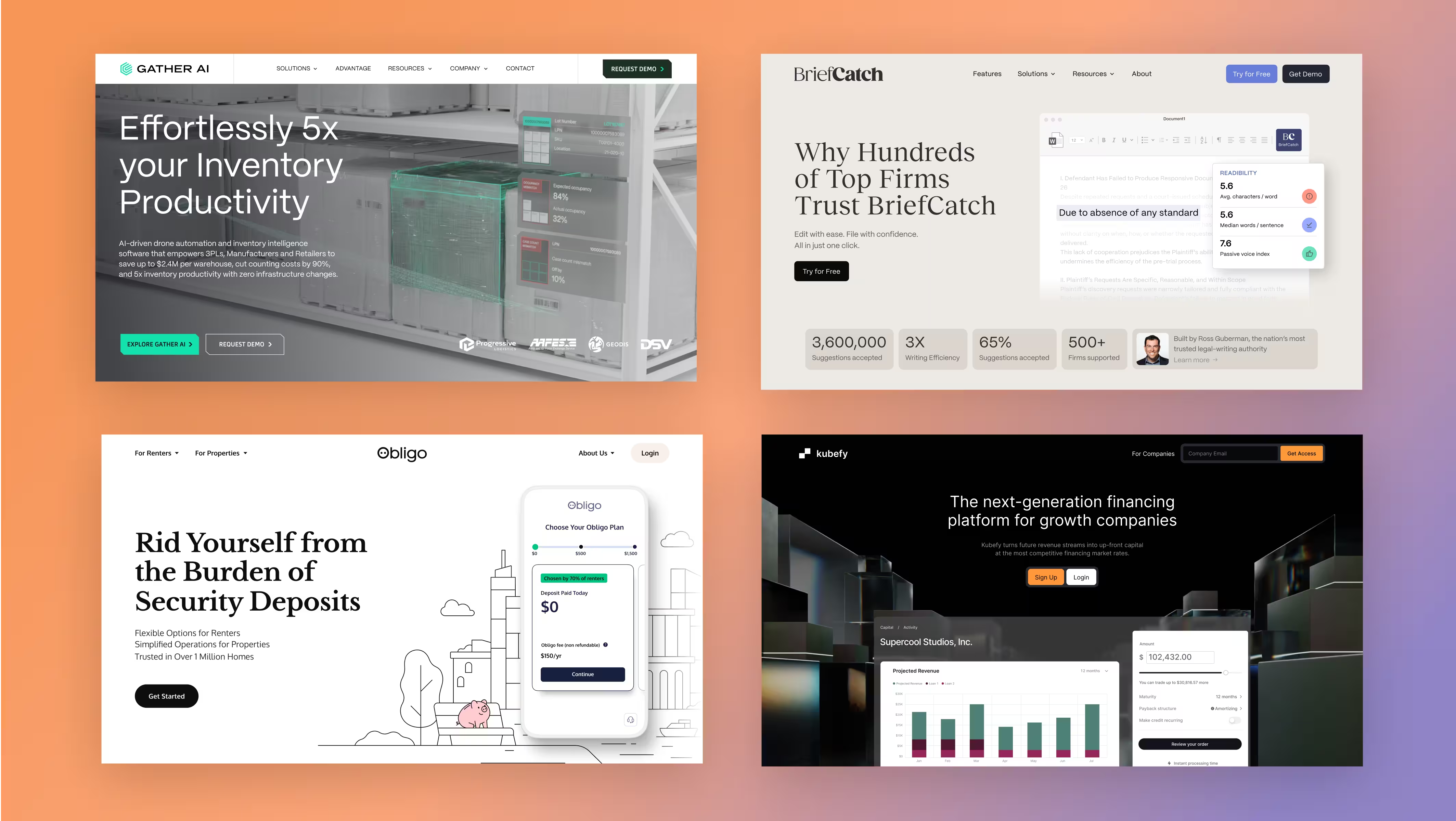
Hero Section = Your Homepage’s Hook
Your hero section is the most valuable real estate on your site. It should immediately communicate who you are, what you do, and why it matters. That doesn’t always mean big headlines and splashy images. It means clarity.
If you’re looking for best hero section design tips, start here:
- Use one clear H1 with supporting subcopy
- Add a strong, primary CTA (like “Book a demo” or “View pricing”)
- Use motion, imagery, or contrast to draw the eye, but don’t overcomplicate

Design Above the Fold for Clarity and Flow
Above the fold isn’t just about what’s shown, it’s about what’s implied. Are you encouraging people to scroll? Sign up? Click through?
Smart homepage design creates hierarchy:
- Use negative space to guide attention
- Let headlines breathe
- Place CTAs in high-contrast zones
- Design for mobile-first
Looking to improve website engagement? Treat the fold like a teaser trailer. Don’t overload it. Entice people to explore.
Structure Your Homepage for Conversion
While this article focuses on first-glance design, remember that above-the-fold performance is closely tied to full-page structure. If the rest of your homepage doesn’t support the message introduced up top, users will bounce.
Read What Makes a Homepage Work? Smart Design Decisions That Drive Engagement if you want a breakdown of what happens after the fold.
Keep Users on Your Website With Intentional Design
Getting someone’s attention is only step one. Keeping it requires:
- Fast load times
- Clear CTAs (not too many)
- Predictable, intuitive navigation
- Visual hierarchy that draws the eye downward
It also helps to use scroll cues, subtle animations, or visual continuity to signal that more content lies below the fold.

Final Thoughts
Homepage design best practices aren’t just about color palettes or trendy layouts. They’re about intent. If you can win the first five seconds, you dramatically improve your chances of winning the rest.
Want help leveling up your hero section, CTA placement, or scroll performance? We help clients structure websites that lead with clarity and convert with confidence. Let’s talk.