For years, the homepage was a company’s polished front door: a single, carefully choreographed snapshot meant to introduce the brand. But modern brands don’t stand still. Product lines evolve. Messaging shifts. New markets emerge. Teams grow. And a homepage built for a single moment in time can’t keep up with a company that changes week to week.
Today’s homepage is more like a living surface than a static billboard. It needs to adapt to new campaigns, highlight new proof points, reflect strategic shifts, and absorb constant content updates. A traditional layout with fixed sections, one-off custom code, and rigid content containers starts showing its age almost immediately.
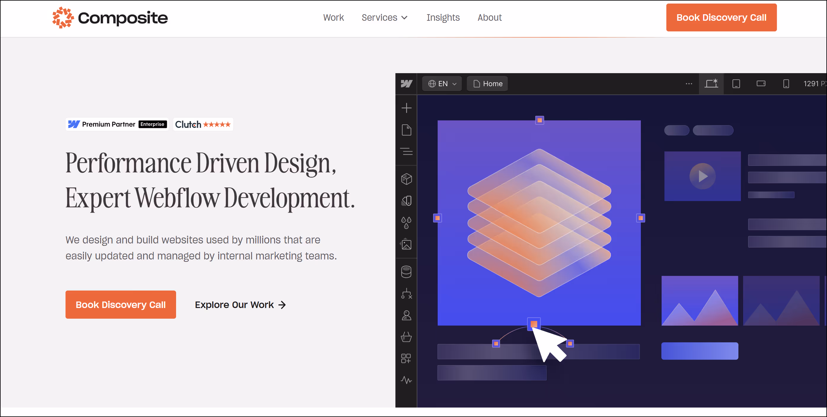
This is why modular homepages have become the new standard. They aren’t just easier to update. They're structurally designed to evolve. As a Webflow agency in NYC working with fast-moving fintech, AI, and medtech brands, Composite sees modularity not as a design choice, but as a long-term strategy for clarity, velocity, and growth.
Why Traditional Homepages Eventually Break
Static homepages look great on launch day because everything is tightly art-directed. The problem is that the moment the company shifts direction, the homepage doesn’t shift with it.
We see the same pattern repeatedly:
- New campaigns don’t fit the original hero format.
So teams crop images, rewrite headlines to force-fit character counts, or cram in secondary CTAs. - Temporary announcements disrupt hierarchy.
A “quick update” block gets added above the fold and then never removed. - One-off layouts accumulate.
A designer adds a custom feature grid, another designer tweaks spacing, and a developer modifies padding for one specific use case.
Over time, the homepage becomes a scrapbook of exceptions. Rigid homepages break because they’re designed for a moment, not a lifespan.
The Modular Approach: A Homepage Built From a System, Not a Snapshot
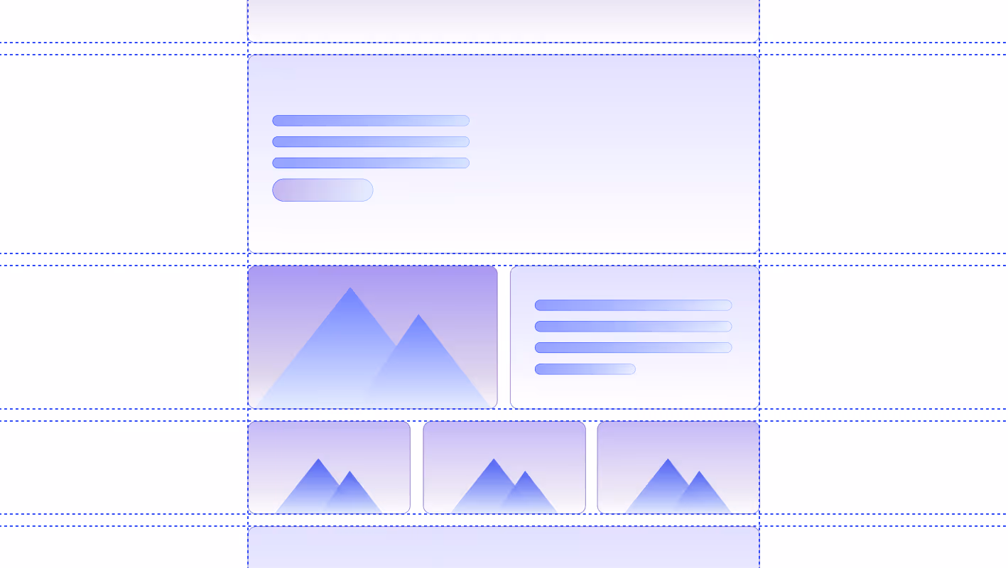
A modular homepage starts with a system-first mindset. Instead of designing one perfect layout, you design a library of flexible, reusable blocks, each with a clear purpose and consistent rules.
A strong modular system often includes:
- Hero variations for product launches, campaigns, or thought leadership
- Value proposition clusters that scale with messaging shifts
- Feature overview blocks that can expand or contract
- Rotating case study modules that pull dynamically from a CMS
- Testimonial or proof components
- Content feeds that highlight insights or announcements
- Partner or integration showcases
Every block follows shared principles: consistent spacing, typographic rhythm, responsive behavior, animation rules, and content parameters.
When these modular pieces snap together cleanly, teams can rearrange or replace sections without breaking the design language. Visual cohesion stays intact even as the homepage evolves weekly or monthly.
Why Modular Homepages Work Better for Fast-Moving Brands
Modular homepages deliver value on three levels: operational, experiential, and strategic.
1. Operational speed
Marketing teams can update content on their own. No dev tickets. No urgent redesigns. No patchwork fixes.
Need to elevate a new product feature for a few weeks? Swap the module. Launching a webinar series? Bring the insights block forward. Announcing a partnership? Add your proof module without redesigning the page.
The system absorbs change.
2. A smoother user experience
Even when content shifts frequently, the experience feels consistent. Users learn patterns like how sections behave, how content flows, and where to find information.
This lowers cognitive load. The homepage feels intentional, not improvised.
3. Strategic alignment
Modularity forces clarity. When every block has a purpose, teams avoid clutter and stay focused on message hierarchy.
Brands grow cleaner, not noisier.
How to Build a Homepage That Scales Gracefully
A scalable homepage requires alignment between design, content, and development.
Designers
Define the system first: spacing tokens, grid logic, breakpoints, interaction patterns, block anatomy, and responsive rules.
Writers
Craft content that fits modular patterns: concise headlines, consistent subcopy lengths, reusable CTAs, adaptable feature descriptions.
Developers
Build components that can be rearranged or duplicated without code debt or custom overrides.
A modular homepage only stays modular if the rules behind it are clear. When teams share an understanding of how sections behave, how hierarchy works, and how content fits into each block, the system stays consistent even as the homepage evolves. Modularity isn’t just visual flexibility, but shared alignment on how the pieces come together.
Why Webflow Is Perfect for Modular Homepages
Webflow is designed for systemized thinking.
- Component logic keeps patterns scalable
- Global styles unify typography, color, and spacing
- Nested components allow variations without chaos
- CMS-driven modules automate dynamic content
- Clean HTML improves accessibility and machine readability
- Design system visibility ensures teams stay aligned
As a Webflow Enterprise Partner in NYC, Composite uses Webflow to create homepages that are maintainable, structured, and durable so they feel custom while behaving like a product.
Clients can reorder modules, test messaging, personalize experiences, and iterate quickly without touching code.
Modularity and AI: A Homepage That Machines Can Understand
This is the missing conversation in most modularity discussions. Modular design isn’t just a UX or operations win, it’s an AI readiness win.
AI agents, including ChatGPT, Perplexity, and Gemini, interpret websites through:
- clear semantic hierarchy
- consistent markup patterns
- predictable content structures
- labeled components
- coherent metadata
- logical internal links
Modular homepages reinforce all of these because the same patterns repeat across variants.
A static, one-off homepage forces AI to “guess” what sections represent. A modular homepage expresses purpose through repeatable structure making it easier for AI agents to parse, summarize, and recommend.
In an era where agentic AI may book demos, identify preferred vendors, or shortlist partners on behalf of users, this clarity becomes essential. For a deeper look, read Designing for AI Agents: How to Structure Content for Machine Interpretation.
The Future: Personalization, Pattern Recognition, and AI-Driven Layouts
The shift toward personalized homepages is already happening. Modular homepages are the only layouts capable of supporting:
- industry-specific variants
- behavior-based personalization
- agent-driven adaptations
- AI-assisted layout suggestions
- dynamic content surfaces
Because the modules are consistent and well-labeled, AI systems can reorganize or re-rank blocks without breaking the experience. Static homepages can’t do this. Modular homepages were built for it.
The Composite Perspective
Composite builds modular homepages because our clients are rarely still. Fintech, medtech, and AI brands move fast, update messaging constantly, and refine their offerings as they learn from users.
A homepage built six months ago may already be wrong today. That doesn’t mean the brand changed, it means the homepage couldn’t keep up.
Modularity fixes that. It makes change feel natural, preserves design integrity, gives teams control, and creates clarity for AI agents and consistency for users.
A homepage isn’t future-proof because it stays the same. It's future-proof because it can change cleanly, confidently, and continuously.