In industries like fintech, AI, and medtech, design isn’t just about beauty, it’s about clarity and trust. These brands deal in abstraction: data, algorithms, or invisible outcomes. That means conversion design isn’t as simple as “add a bigger CTA.” It’s about translating complexity into confidence.
At Composite, we design digital experiences that simplify technical products without dumbing them down. Whether it’s guiding investors through a data-heavy dashboard or helping patients understand an AI health platform, conversion starts with comprehension.
Why Trust Is the Real Conversion Metric
For fintech, AI, and medtech companies, trust is often more valuable than clicks.
Visitors arrive with caution. They’re evaluating your legitimacy, security, and clarity before they ever think about signing up or scheduling a demo. That’s why UX decisions that seem small (consistent spacing, crisp typography, accessible colors) play an outsized role in how credible your product feels.
Key UX principles we apply:
- Consistency over flash. Predictable interaction patterns reduce friction and cognitive load.
- Data visualization for reassurance. Charts, metrics, and certifications anchor abstract technology in tangible proof.
- Performance as persuasion. Fast, responsive design signals reliability, something every fintech or medtech user expects instinctively.
Trust is not a single design choice; it’s the sum of thousands of small, consistent signals.
Structuring for Clarity: UX as Content Strategy
Conversion design starts long before a button click—it starts in how your story is structured.
In complex industries, every page competes for attention with jargon, compliance text, and technical copy. A clear content hierarchy ensures your audience always knows what’s next.
At Composite, we use UX strategy and CMS web development services to organize this information into intuitive systems that scale as a product grows.
What this looks like in practice:
- Concise, results-focused headlines paired with expandable sections for deeper detail.
- Flexible CMS-driven content blocks to maintain consistency across hundreds of pages.
- Interactive modules that reveal complexity gradually rather than dumping it all at once.
The goal: guide, don’t overwhelm. Your content should feel like a conversation, not a documentation dump.
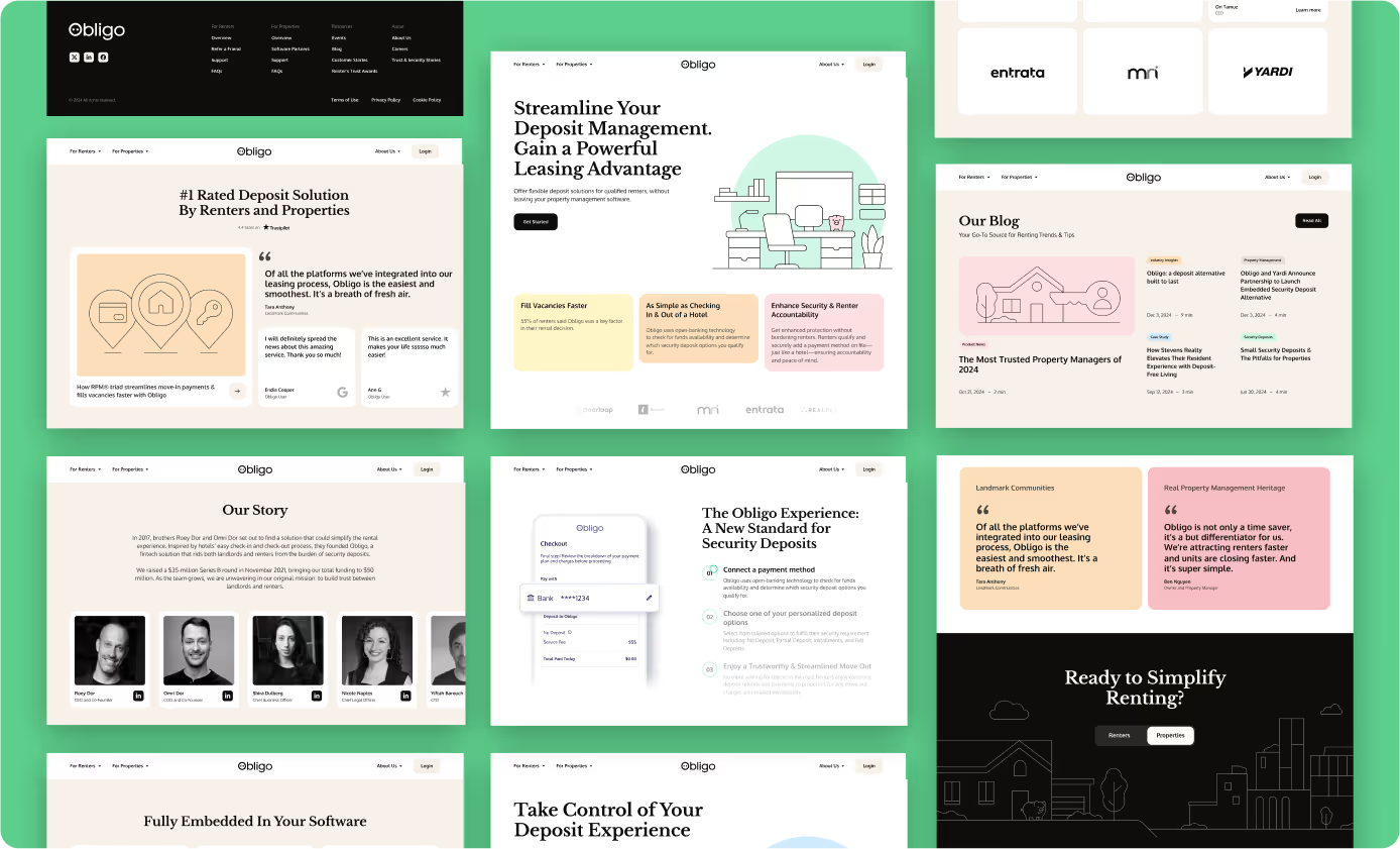
Humanizing Financial Tech Through Design: The Obligo Example
For fintech companies like Obligo, design isn’t just about interface polish. It's about trust, comprehension, and emotional connection.
Obligo helps renters move in without paying a traditional security deposit, using modern financial infrastructure to streamline cash flow for both tenants and property owners. The product is highly technical behind the scenes, but its value hinges on one universal human emotion: relief.
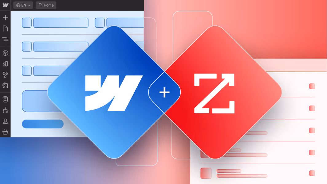
When we migrated Obligo’s site from WordPress to Webflow, our goal was to make that relief tangible. We restructured their content system for clarity, using storytelling-led UX that simplified complex financial concepts without losing depth. Interactive animations and a state-by-state regulation map turned dry compliance data into something visual and empowering.
The result: a site that feels approachable, fast, and trustworthy—the digital reflection of a fintech brand designed to make life easier, not harder.
In an industry where data can easily overshadow empathy, Obligo’s redesign proved that financial platforms don’t need to feel transactional. With the right UX strategy, even the most technical products can feel transparent, personal, and human. Read the full case study here.
For medtech and AI clients, we apply the same logic:
- Color-coded categories and microinteractions help users interpret data quickly.
- Responsive layouts maintain visual rhythm from dashboards to mobile views.
- Consistent motion and typography create familiarity across complex product ecosystems.
In short: design systems make technical products feel human.
UX for Decision Confidence
A great landing page doesn’t just push users to convert — it helps them feel confident in doing so. That’s where responsive design and UX strategy intersect.
We use behavioral analytics tools like Microsoft Clarity and Google Tag Manager to test which interactions increase confidence, not just clicks. Subtle design shifts, like surfacing case studies near pricing or embedding live demos, help users make decisions faster.
For AI startups and medtech platforms, decision friction usually isn’t “Can I afford this?” but “Can I trust this?” UX design that clarifies data sources, process transparency, and compliance turns uncertainty into momentum.
Designing for Ourselves the Way We Design for Clients
When we rebuilt our own site in 2025, the goal wasn’t just aesthetic.
We wanted potential clients to see themselves in our site: fintech, AI, medtech, and other complex industries looking for a partner who speaks their language.
The redesign pushed us to look less like a traditional creative agency and more like the tech brands we serve with cleaner interfaces, faster navigation, and a graphic system rooted in minimalism and vector precision. Every detail was engineered for clarity and scalability.
We also expanded our CMS to handle content growth at enterprise scale: auto-populated schema markup, dynamic integration and migration sections, and new analytics layers through Webflow Analyze, Microsoft Clarity, and SEMrush.
From a UX perspective, consistency became the conversion engine. Our CTAs follow a unified pattern, service pages link directly to detailed guides, and each new case study bridges storytelling with SEO. The result: a site that performs like the brands we build for. Professional, youthful, and operating at the speed of New York City.
Designing for Agents and AI Intermediaries
As AI assistants and search agents evolve, they’ll increasingly navigate and summarize websites on behalf of users. That means your conversion design must now speak two languages: human and machine.
How this impacts UX:
- Structured clarity. Use semantic HTML, descriptive link text, and schema markup so agents understand your value proposition.
- Encoded trust. Certifications, pricing, and FAQs should exist in both visual and structured forms so agents can accurately represent you.
- AI-ready CTAs. Clear, action-oriented metadata (“Book a demo,” “Download whitepaper”) helps models interpret user intent.
Your next user might not be a person clicking your site; it could be an AI recommending it. Conversion design now extends to how your brand is interpreted by machines. For more, read Agentic AI and AX: How AI Is Reshaping UX and Marketing.
Compliance & Ethical Design as Conversion Catalysts
In fintech and medtech, compliance and transparency aren’t just legal requirements, they’re conversion assets.
When users see clear security language, visible data policies, and easy opt-outs, trust skyrockets.
What this looks like in practice:
- Displaying SOC 2, HIPAA, or GDPR compliance badges prominently.
- Avoiding dark patterns: no pre-checked boxes or hidden disclaimers.
- Surfacing privacy information contextually, not buried in footers.
- Explaining how data is stored or processed right on conversion-critical screens.
Ethical design isn’t just moral; it’s measurable. Every act of transparency earns attention and conversions.
The Composite Approach
Every project we take on follows a pattern: discovery, clarity, and scale.
- Discovery: We uncover what users don’t understand about your product and why.
- Clarity: We use clear copy, UX, and content architecture to simplify without dumbing down.
- Scale: We build in Webflow, a CMS-driven, enterprise-ready platform that supports dynamic growth, responsive design, and SEO optimization.
- Ongoing QA: We monitor performance post launch, staying in touch with your team to ensure success.
As a UX design agency in New York, we focus on complex digital ecosystems—the kind where clarity, trust, and detail drive every decision.
What Success Looks Like
Conversion isn’t only about numbers, it’s also about alignment. When design, product, and marketing work together, users don’t just act; they believe.
For our fintech and medtech clients, this often means:
- Shorter onboarding times
- Higher engagement with product demos
- Increased lead-to-sale conversion rates
- Clearer analytics across devices and markets
The takeaway: you can’t convert what users don’t understand.
And in complex industries, understanding is the most powerful conversion tool of all.