Ever land on a website and feel instantly overwhelmed, like the page is yelling at you in ten fonts, five colors, and zero logic?
You’re not alone. And you probably didn’t stick around.
That’s the silent killer in UX: poor visual hierarchy. When nothing stands out, everything feels like noise. Users don’t know where to look, so they bounce. Let’s talk about reducing exits by leading the user with visual hierarchy.
What Is Visual Hierarchy?
Visual hierarchy is how we design what gets noticed first, and what gets noticed second, third, or not at all.
It’s not just about making things “pretty.” It’s about prioritizing attention so users naturally follow the flow of your site. Think of it like directing traffic: Headlines should get the fast lane. CTAs should flash like exit signs. Supporting details should wait patiently on the shoulder.
Whether we’re building a marketing site, a product platform, or a simple landing page, we use hierarchy to guide users without friction or confusion.
The 5 Forces of Visual Hierarchy
There are a handful of design tools that quietly (or loudly) shape what your users notice and act on. Here’s how they work and how they go wrong.
1. Color & Contrast: The McDonald’s Effect
Red and yellow aren’t just loud, they’re deliberately loud. McDonald’s didn’t choose those colors by accident. Research shows that red can trigger urgency and appetite, while yellow grabs attention and sparks feelings of joy. Together, they say: “I’m hungry, and I want it now.” It also doesn’t hurt that they’re the colors of ketchup and mustard (suddenly you’re craving fries, right?).
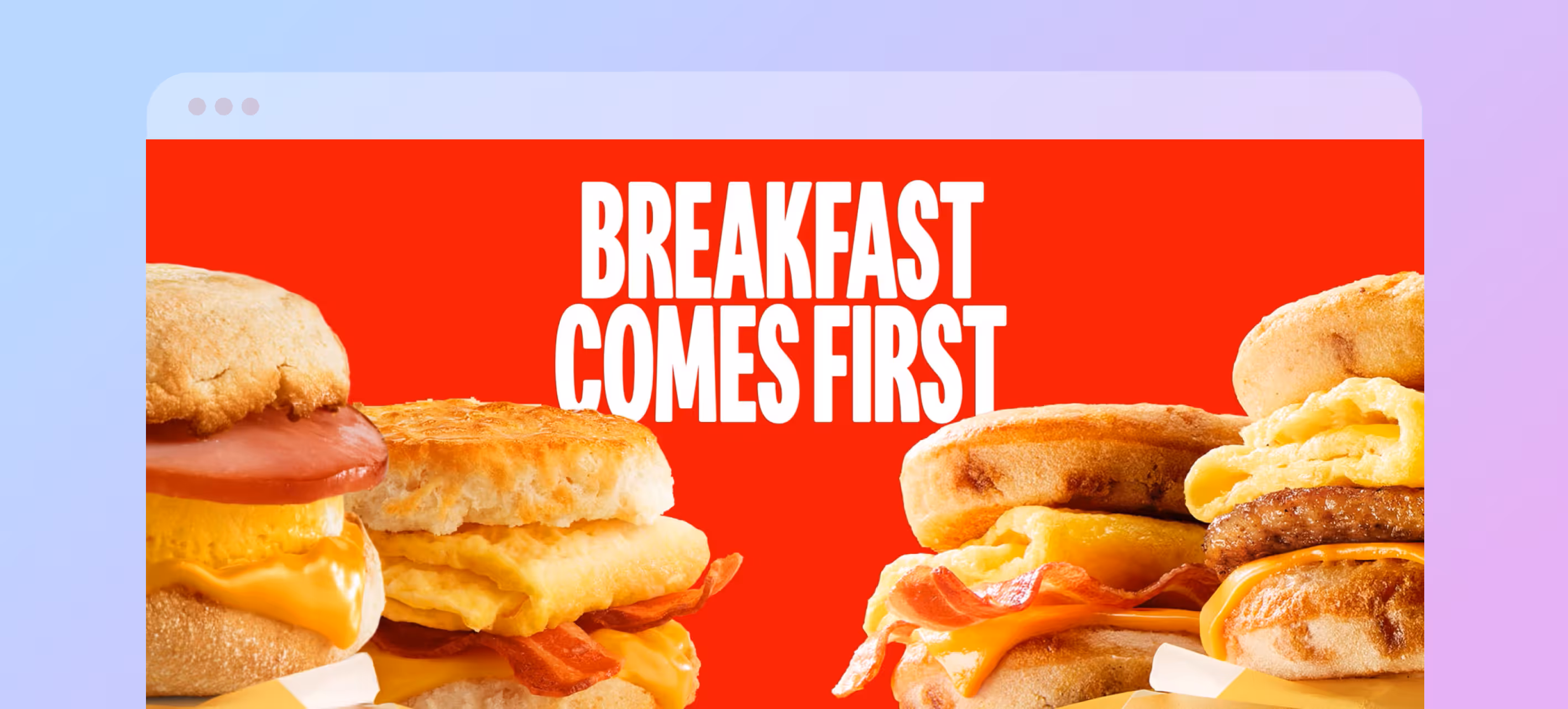
Designers use color and contrast the same way: to direct focus, suggest emotion, and differentiate elements.
Best Practices:
- Stick to 2–3 core brand colors and use contrast wisely. Bold colors for primary actions, muted tones for background or secondary content.
- Check accessibility. High contrast helps everyone, especially users with visual impairments.
- Want calm, trustworthy vibes? Use blues and neutrals. Want to stir excitement or draw the eye fast? Think warm, saturated tones.
2. Scale: Big Things Shout, Small Things Whisper
We instinctively look at the biggest thing first. It’s why headlines dominate news sites and product images often outsize descriptions.
Scale doesn’t just mean font size—it applies to buttons, images, cards, icons—anything with visual weight.
Best Practices:
- Use a clear hierarchy: Headline → Subcopy → CTA or Body Text.
- Limit the number of large elements per page. If everything’s “important,” nothing stands out.
- Pair scale with spacing. Bigger objects need breathing room.
3. Grouping: Make It Make Sense
Ever been on a site where the pricing plan looks like it’s floating next to the FAQ and you can’t tell what belongs together? That’s a grouping issue.
Grouping means placing related items near each other, or enclosing them visually, to show they belong together.
Best Practices:
- Group by function (e.g. all CTAs, all links, all product specs).
- Use proximity or containers, but don’t overdo borders.
- Test grouping with fresh eyes: can someone guess what belongs together in 5 seconds?
4. Whitespace: The Pause Button for Your Eyes
Whitespace isn’t wasted space, it’s the design equivalent of silence in a conversation. It helps ideas land and gives the viewer’s brain the opportunity to focus.
Think of an Apple product page. Why does it feel so luxurious? It’s not just the photos, it’s the room around them. Whitespace tells your brain, “Hey, this matters. Pay attention.”
Best Practices:
- Break content into easy chunks: 1-2 sentence paragraphs, plenty of line spacing, generous margins.
- Use whitespace intentionally around key elements like CTAs, headers, and product visuals.
- Don’t fear empty space. Embrace it. It creates clarity.
5. Typography: Set the Tone Before a Word Is Read
Typography does more than display readable words, it sets the mood. A luxury hotel site in Comic Sans? That is a crime!
The font, weight, spacing, and size all signal things before a user reads the actual content.
Best Practices:
- Limit typefaces. Using too many fonts always ends up looking cluttered and unprofessional. Stick to two or three, at the most.
- Establish type hierarchy: H1s, H2s, body, and so on should be clearly defined and consistent.
- Match tone to purpose. Want trust? Keep it clean. Want fun? Get playful, but don’t lose legibility.
How People Actually Read Websites
Eye-tracking studies and heatmaps show three common patterns users follow—each one shaped by your visual hierarchy and shaping the experience in return.
Z Pattern: Quick Scan, Fast Decisions
In the Z Pattern, the user’s eye traces a “Z” across the page: left to right across the top, diagonally down, then left to right again at the bottom.
Use it when your content is visual, sparse, and high-impact.
Pro tip: Put key CTAs at the start and end of the Z path.
F Pattern: Skim Until Something Sticks
In the F Pattern, users scan the top lines, then scroll down along the left edge, occasionally scanning right when something catches their eye.
Use it for content-heavy pages like blogs and help centers.
Pro tip: Use headers, bullets, and bolding to help users find key info.
Layer Cake Pattern: Sweet, Structured Scrolling
This pattern uses evenly spaced content blocks: headline, snippet, image, CTA, repeat.
Use it to guide smooth scrolling and keep users engaged.
Pro tip: Alternate visuals and text to keep rhythm and momentum.
Avoid These Visual Hierarchy Mistakes
Even good designers fall into these traps. Here's what to watch out for:
Overcrowding
Adding too many elements easily overwhelms users. Fix it with breathing room and prioritize one key action per screen.
Low Contrast
Grey text on a light background? No one can read that! Fix it with bold, accessible color and typography.
Too Many Choices
Ten buttons, all screaming “click me”? That causes decision fatigue and users will quickly exit. Fix it by guiding users step-by-step.
Inconsistent Styling
Random font sizes and button styles reduce your credibility. Fix it with a visual system that stays consistent and clean across the site.
How to Test Your Visual Hierarchy
You don’t need a lab or a big team to see if your design is working. Try these:
The Squint Test
Squint or blur your screen. What stands out? If your most important elements fade into the background, adjust them.
User Feedback
Ask real people: What’s the first thing you noticed? What would you click next? A few honest answers go a long way. Watch their journey through your design and notice the time it takes them to reach their goal.
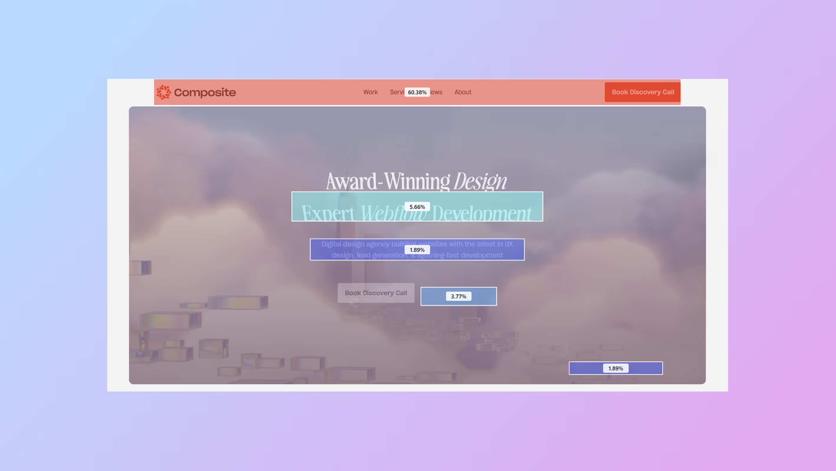
Heatmaps & Eye-Tracking
At Composite, we use tools like Microsoft Clarity to show us where people scroll, click, and pause. Use this data to improve what’s being missed or ignored.
For a detailed look at what to include on your site, read our posts What Makes a Homepage Work and What Goes Above the Fold Still Matters.
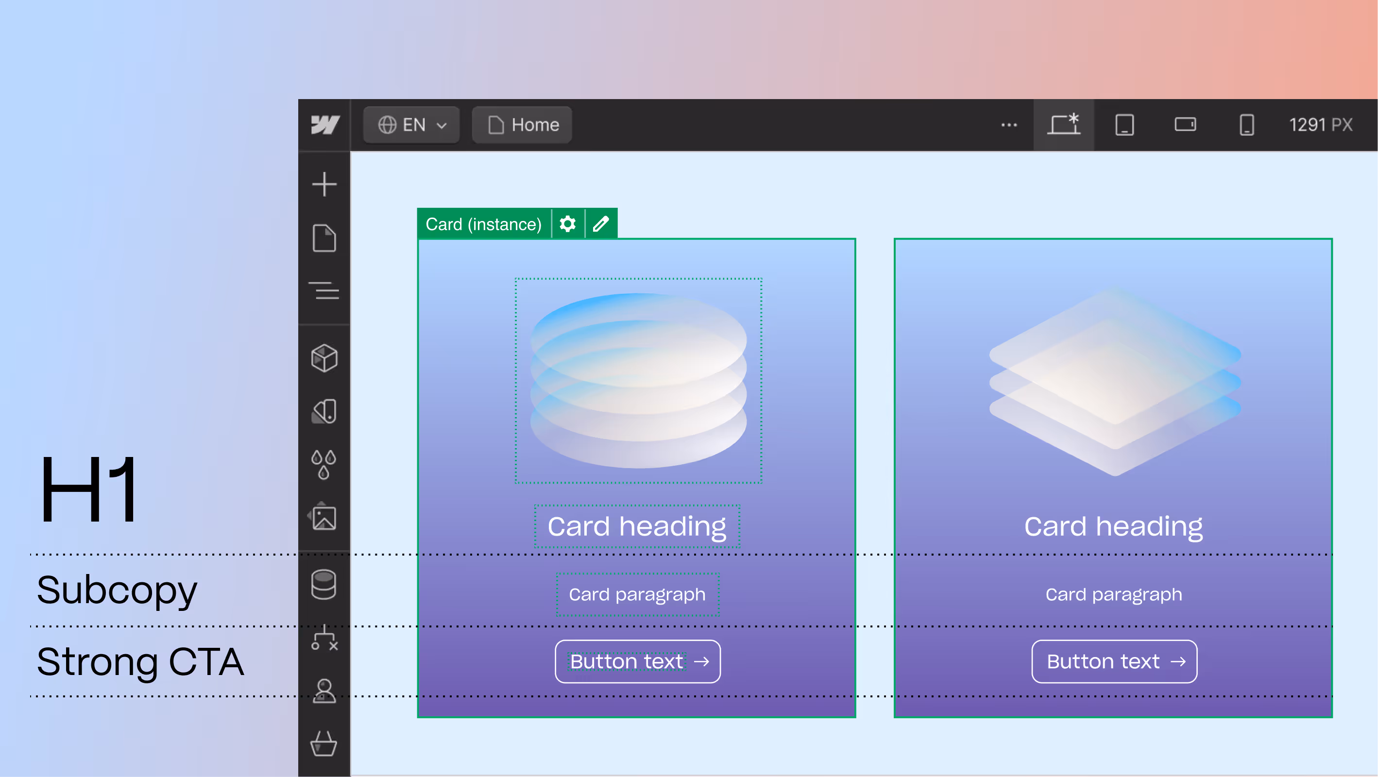
Why We Build in Webflow
Composite specializes in UX and Webflow for a reason: it gives us full control over visual hierarchy, without relying on dev sprints for every layout tweak.
Whether we’re designing subtle shifts in scale for mobile, or A/B testing CTA colors for conversion, Webflow lets us iterate fast, stay on-brand, and build experiences that feel intuitive from the first glance.
It’s like having a design system, CMS, and animation toolkit all in one—perfect for crafting digital experiences that don’t just look great but work great too.
Let Your Design Speak Loudest
Visual hierarchy isn’t about decoration. It’s about communication. It’s how your site tells users where to go, what matters most, and what to do next—without them even realizing it.
When done well, it builds trust, lowers bounce rates, and creates seamless experiences across devices.
Want a design that speaks loud and clear?
Let’s talk. Whether you're refreshing your site or migrating to Webflow, we’ll help you create a UX that actually converts.