When users land on your site, they’re making a split-second judgment about your brand, your offering, and whether they trust you enough to take the next step.
That next step could be anything: booking a demo, subscribing to a newsletter, making a purchase. But no matter the goal, your UX needs to help users get there without confusion or friction.
Here’s how we think about UX design at Composite when conversion is the goal.
Lead with clarity and consistency
A clear layout with a consistent visual language helps users navigate instinctively. That means:
- Strong hierarchy in your typography and spacing (read our post How Visual Hierarchy Shapes UX for more)
- Thoughtful use of color and contrast
- Predictable placement of buttons and CTAs
And yes, style matters—but polish isn’t everything. If your design doesn’t serve the user’s intent, it’s just decoration. (We wrote more about this in our post How Motion Elevates UX in Webflow.)
Build trust through design and content
Trust is a huge conversion factor, especially for new users. Reinforce trust on your website with:
- Social proof: Testimonials, case studies, and reviews
- Visual consistency: Professional, modern design goes a long way
- Clear messaging: Avoid jargon. Say what you mean.
Badges, security icons, and certifications can help, but so can personality. A conversational tone and a little transparency go a long way. For a deeper look, read What Goes Above the Fold Matters.

Reduce friction at every step
Conversions drop when users get stuck or confused. You can prevent that by:
- Improving page load speed (Webflow helps here)
- Avoiding unnecessary popups or modals
- Using smooth transitions to guide attention, not distract from it
And make it easy to fix mistakes. If a form fails, tell users why in plain language. Bonus points if your error messages have a little personality.
Want to reduce friction during your site migration? Check out our migration guides for tips on facilitating healthy migrations with less issues.
Personalize without creeping
Personalization boosts conversions, but only when done with care. Consider:
- Role-based dashboards for different user types
- On-site recommendations based on past behavior
- Localization for language, region, and culture
A few tweaks can dramatically improve UX for international audiences, too. That’s why adaptive and responsive design is baked into every Webflow project we deliver.
Check out our post about Webflow’s AI features to see how they can help you personalize your site.
Support accessibility from day one
Good UX works for everyone—including users with disabilities. Prioritize:
- Clear, descriptive alt text
- Keyboard navigability
- High color contrast and legible fonts
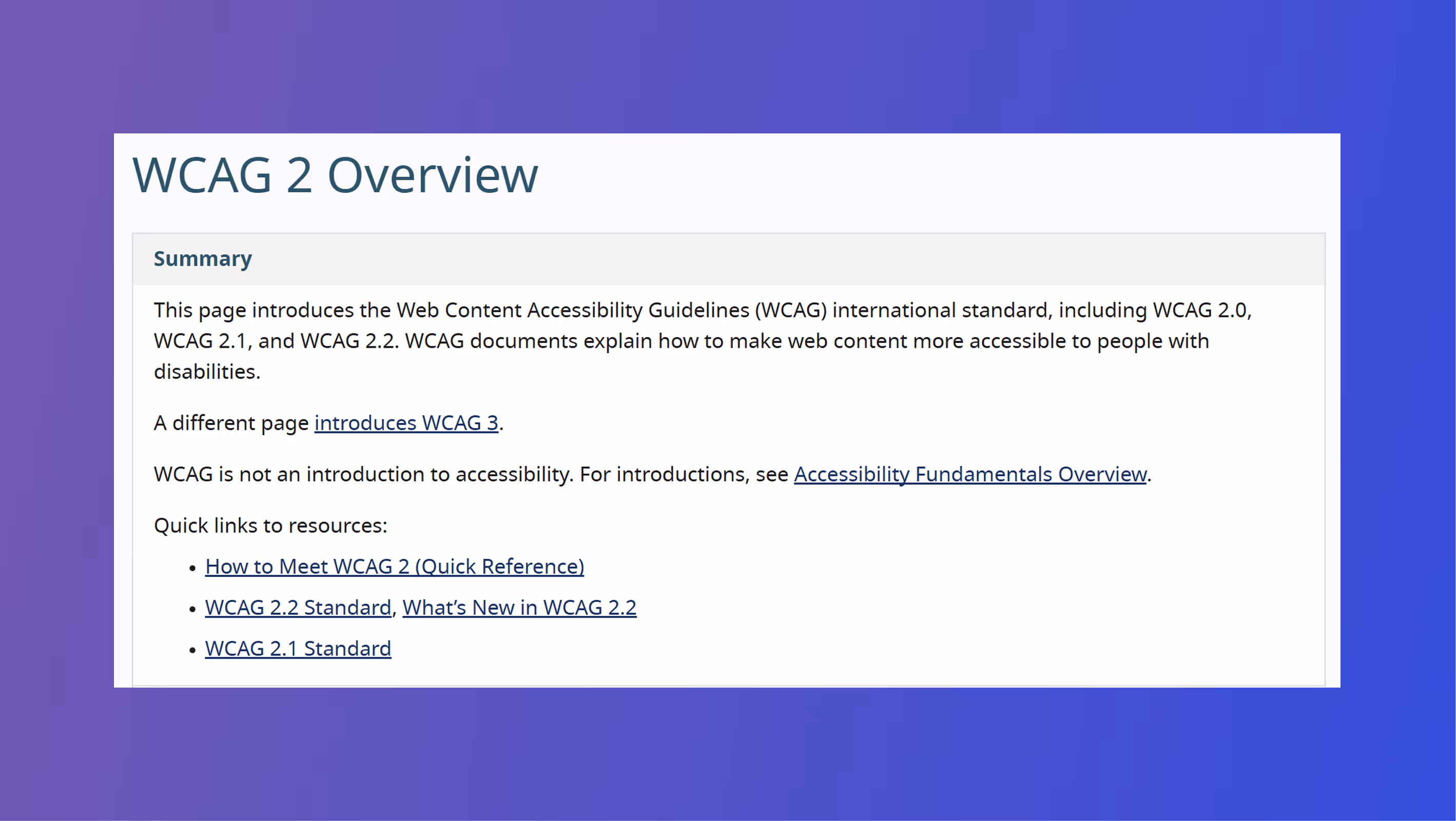
Accessibility is also great for SEO and often overlaps with your mobile experience. If you’re investing in optimization, this is non-negotiable. Read through WCAG 2 guidelines for more accessibility information and requirements.
Think beyond the interface
Conversion-friendly UX isn’t just about layout—it’s about how the site behaves. That includes:
- Flexible admin features (like simple content editing post-launch)
- Multiple payment options for eCommerce
- Intuitive account flows (signup, login, password reset)
And don’t underestimate the power of a well-placed confirmation message, loading animation, or empty state.
Test, track, improve
UX doesn’t stop at launch. Regular testing helps you:
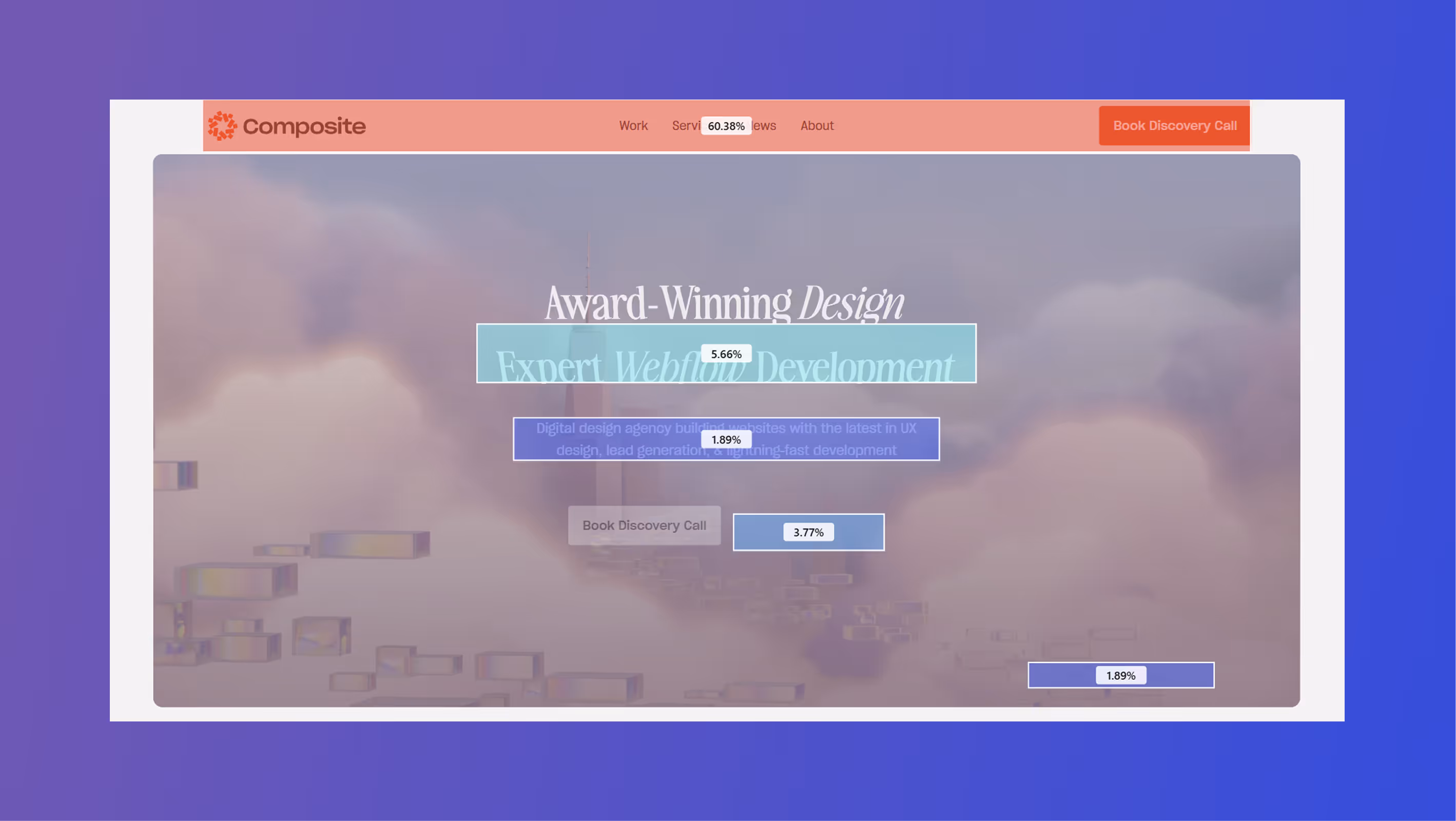
- Compare CTA language and placement with A/B tests
- Optimize key flows using tools like Microsoft Clarity
- Monitor bounce rates, heatmaps, and conversions over time
Want to see how we bake testing and iteration into our projects? Check out how we build scalable design systems in Webflow to support long-term UX evolution.
Final Thoughts
The best UX is invisible. When done right, it fades into the background while guiding your users to the outcome you want—and the one they need. For more on
Looking to optimize your website for real-world performance?
Let’s talk.