As a Webflow-first web design agency in New York, we partner with companies at every stage, from lean startups to large enterprises navigating digital transformation. Whether scaling fast or managing complexity, many are facing the same challenge: design systems that are starting to break down.
Their component libraries are overflowing, but they’re still wrestling with layout inconsistencies, styling drift, and development handoff headaches.
We get it. Design systems were supposed to streamline everything. But over time, the component-first model creates complexity instead of clarity. The result? A bloated system that doesn’t scale and a digital presence that can’t keep up.
Why Traditional Design Systems Break Down
Design systems—especially in fast-moving environments—are failing for a few key reasons:
- They're optimized for documentation, not implementation
- They emphasize components over context
- They age faster than internal teams can maintain them
- They assume one source of truth, rather than modular flexibility
We’re not the only design agency seeing this. Experts like Brad Frost and Dan Mall have all acknowledged that traditional systems are hitting their limits.
A Modular Approach to Design Systems in Webflow
At Composite, we help clients rebuild scalable design systems that work in real-world, evolving products—especially those built in Webflow.
Here’s how we approach it:
1. Structure-first thinking
We start with flexible content blocks, not rigid layouts. This helps us design websites that scale dynamically through the Webflow CMS and future-proof content workflows as the product evolves.
2. Token-driven scalability
Instead of hardcoded styles or bloated components, we use design tokens for typography, spacing, and color. It’s how we maintain consistency while allowing for modular flexibility across themes or branded sub-sites. For a closer look at how motion fits into scalable UX, check out How Motion Design Elevates UX in Webflow.

3. Reusable, not redundant components
We think about reusability across layouts and screen sizes, not one-to-one template swaps. Every module is designed to serve multiple contexts, so nothing’s locked to a single landing page or use case.
4. Living documentation across tools
We use Notion, Figma, and Webflow itself to document systems as we go, not just as a handoff. It’s part of how we support smooth website migration and long-term usability across platforms. Learn how we support seamless transitions in our website migration guides—from legacy systems to scalable Webflow builds.
What We've Learned as a Web Development Agency
We’ve seen that rigid systems don’t break suddenly, they erode over time. And the damage is felt across design, dev, and content teams. Here’s what we’ve adjusted in our own process:
- We've coupled atomic components with separate layout primitives like Spacers and Modular Grids to make it easier to build complex interfaces while maintaining consistency.
- We embed design systems directly into live projects so structure, scalability, and implementation evolve together from day one.
- We plan for content governance upfront, designing flexible CMS structures and editorial workflows before the first page goes live.

Why This Matters for Digital Strategy
A bloated design system doesn’t just slow down production, it weakens your entire digital strategy. When modularity breaks, so does maintainability. And when teams stop trusting the system, inconsistency spreads fast.
That’s why modern systems need to align with your digital transformation goals, not just your dev team’s preferences.
Where Design Systems Are Going Next
We’re seeing the next generation of systems take shape in three key ways:
1. From components to tokens—and beyond
Token-based systems are replacing static components, allowing brands to adapt across digital platforms while keeping a single design language. The next step? Context-aware systems that adapt behavior based on business rules.
2. AI-assisted and model-driven design
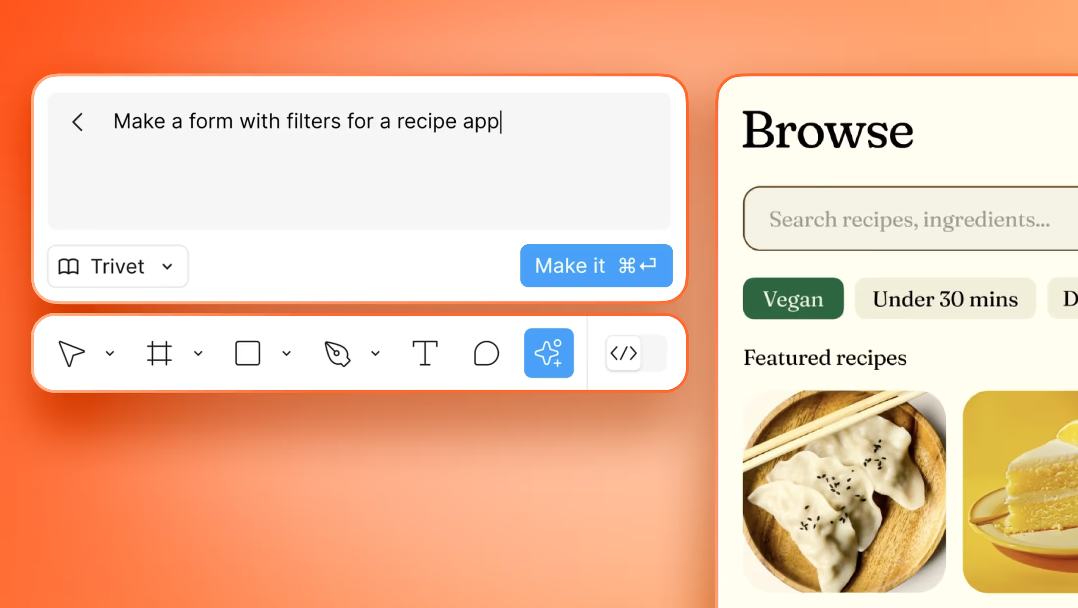
More teams are exploring systems that generate layouts based on data—automating everything from page structure to component population. These aren’t just wireframes, they’re dynamic systems connected to your website migration services, CMS, or product logic. Read more here about How Figma’s New AI Tools Are Changing the Future of Web Design.

3. Composable, purpose-built systems
No more massive monoliths. Systems are becoming task-specific and modular, built to serve the experience, not the org chart.

Final Thoughts
Design systems aren't defined by how many components they have.
They’re defined by how effectively they support your digital presence, your team’s creativity, and your ability to scale without rebuilding everything from scratch.
That’s what we build for.


