Ten years ago, the debate between responsive and adaptive design dominated digital strategy meetings. The rise of mobile-first browsing made one thing clear: websites could no longer be designed just for desktop.
By 2025, responsive design has become the industry standard. Still, adaptive design hasn’t disappeared, it’s just evolved. As AI, personalization, and advanced CMS platforms like Webflow redefine what “mobile-friendly” really means, businesses face a new version of an old question: Which approach should we choose?

What Is Responsive Design?
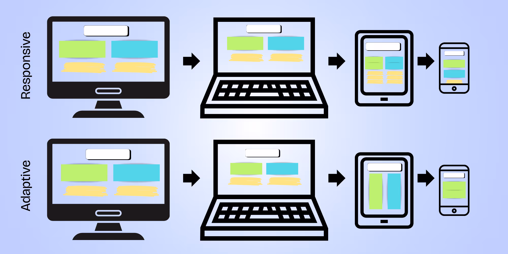
Responsive design is a flexible approach where layouts adapt to any screen size using fluid grids, flexible images, and CSS media queries.
Key traits of responsive design:
- Fluid layouts: Content automatically resizes across devices.
- Single codebase: You design once, and the site works everywhere.
- Consistency: Ensures a unified brand experience.
Pros:
- Cost-effective to maintain.
- Scalable across new device types (from foldables to widescreens).
- Google-friendly since mobile responsiveness is a core ranking factor.
Cons:
- Sometimes “one-size-fits-all” layouts don’t fully optimize for specific devices.
- Complex animations or custom breakpoints can be harder to manage.
Most of the best website designs you see today use responsive layouts to ensure users have a smooth experience whether they’re on desktop, laptop, tablet, iPhone or Android.
What Is Adaptive Design?
Adaptive design takes a different route: instead of one flexible layout, it delivers different versions of the site for predefined screen sizes (desktop, tablet, mobile, etc.).
Key traits of adaptive design:
- Predefined breakpoints: Sites detect the device and load a specific layout.
- Tailored experiences: Each version can be optimized for its screen.
Pros:
- More precise control over the user experience.
- Can be faster to load if layouts are device-specific.
Cons:
- More expensive to build and maintain.
- Doesn’t scale well as new devices appear.
- Risk of inconsistencies across platforms.
Some eCommerce design services still use adaptive design for product-heavy online retail businesses, tailoring mobile UIs for conversion.
Responsive vs. Adaptive in 2025
The gap between responsive and adaptive is narrower than ever, but here’s how they compare today:
- SEO and Performance: Responsive remains Google’s preference. Adaptive sites risk duplicate content issues if not implemented carefully.
- UX Strategy: Responsive design creates scalable digital experiences, while adaptive can provide hyper-targeted flows (though harder to maintain).
- AI and Accessibility: Adaptive layouts can fragment data, while responsive + semantic markup ensures AI agents can parse sites effectively.
In short, responsive design is the baseline. Adaptive is situational. Hybrid approaches (responsive sites with selective adaptive enhancements) are emerging as a best-of-both-worlds solution.
Which Approach Should You Choose?
If you’re deciding between responsive and adaptive, here’s a quick guide:
- Choose responsive if you want a scalable, future-proof website with long-term SEO value.
- Choose adaptive if your site has specific, device-driven needs (like an app-like mobile store).
- Choose hybrid if you want to combine responsive design with selective adaptive features.
How AI Is Changing the Conversation
AI is blurring the lines between responsive and adaptive.
- Personalization without multiple layouts: AI can adjust site content dynamically (think: tailored CTAs, personalized product feeds). This reduces the need for heavy adaptive design.
- AI-ready markup: Responsive design combined with schema and llms.txt helps search engines and AI assistants understand site structure.
- Smarter CMS platforms: Tools like Webflow integrate responsive frameworks with AI-powered optimization, letting businesses design once but adapt intelligently.
This is why many businesses partner with a UX design agency, not just to build a site, but to make it optimized for AI.
The Role of UX Strategy
At Composite, we’ve learned that responsive design without UX strategy is just resizing boxes. True performance comes from designing for user journeys.
Key UX strategy principles:
- Consistency across touchpoints: From desktop dashboards to mobile checkouts.
- Accessibility as part of responsiveness: Semantic headings, alt text, and contrast ratios aren’t “extras,” they’re UX fundamentals. To learn more, read Accessible by Design: How AX and Accessibility Overlap.
- Design like your audience: Great marketing agency websites reflect the industries they serve. For instance, when we recently redesigned our own site, we leaned into visuals and language that resonate with fintech, AI, and tech audiences.
Final Thoughts
In 2025, responsive design remains the gold standard. Adaptive design still has use cases, but its role is narrower, often for highly specialized industries.
The real shift? Pairing responsive frameworks with UX strategy and AI readiness. That’s how businesses move beyond looking good to delivering digital experiences that are scalable, accessible, and future-proof.
Ready to migrate to Webflow or redesign with a design agency in NYC that blends UX, AI, and responsive design? Let’s talk.