There was a time when people made things online because they wanted to. Not to rank or convert. Not to optimize for a feed. They made websites to show off, experiment, play, and sometimes just annoy their friends.
If you were online in the late ’90s or early 2000s, you remember it. The internet felt chaotic, colorful, and deeply personal. Every click led somewhere unexpected. Pages loaded slowly, blinked aggressively, and often made questionable design choices. And somehow, that was the appeal.
When People Built for Themselves
Early personal websites weren’t designed to scale. They were designed to express.
Fan pages, game sites, flash experiments. Animated cursors, background music you didn’t ask for, and entire sites dedicated to a single joke. You’d stumble onto something strange, bookmark it, and show your friends later.
People customized everything. Fonts, layouts, colors, images. Nothing matched, and nothing needed to. Even when it was ugly, it was unmistakably someone’s.
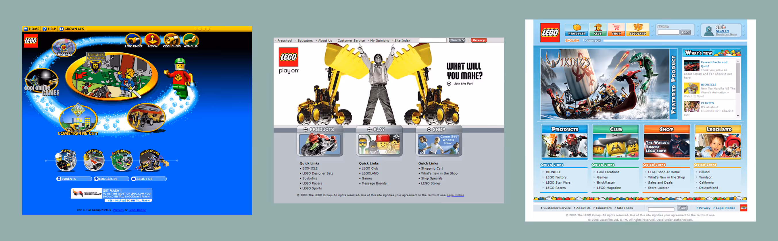
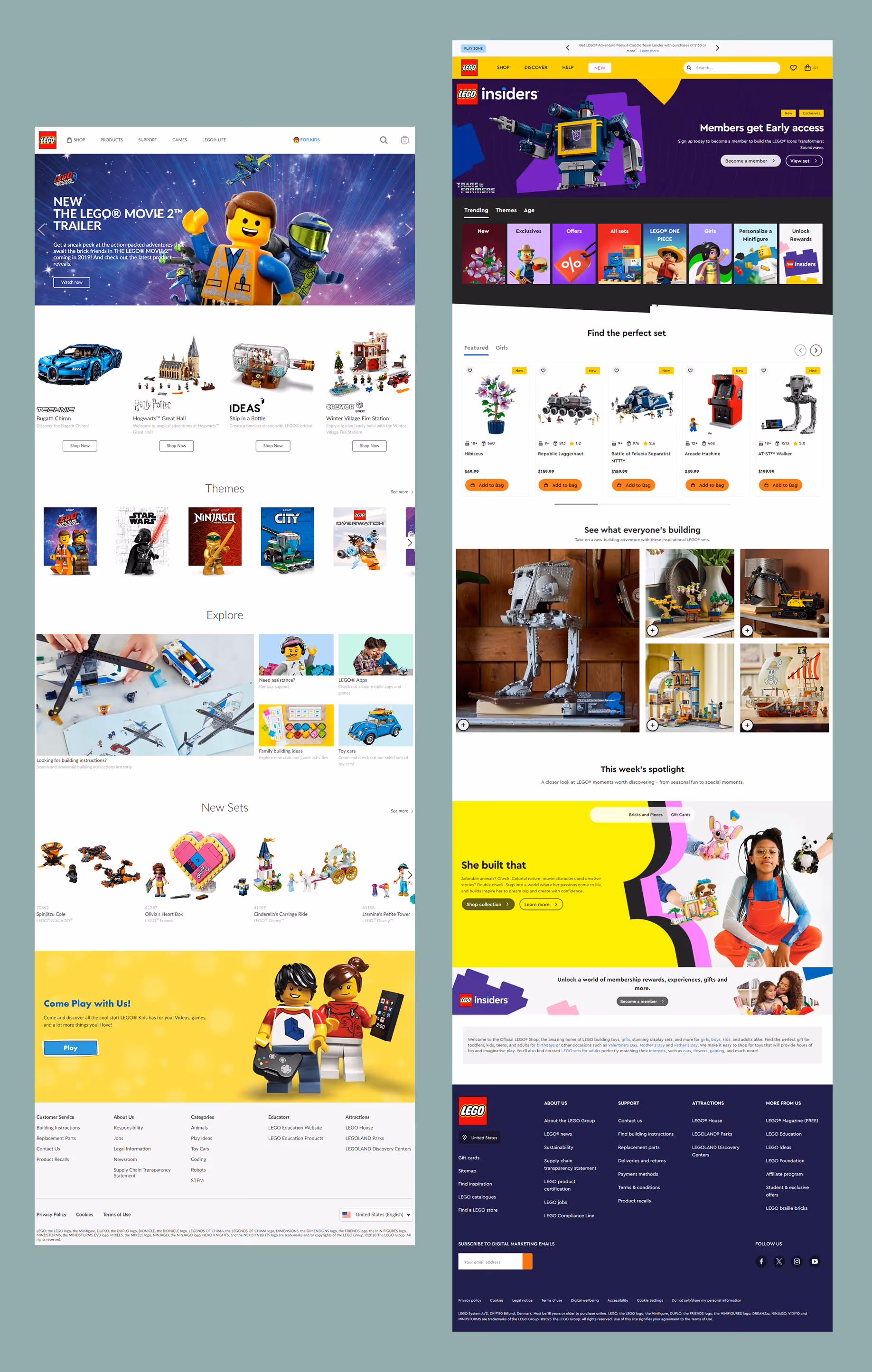
MySpace took this to an extreme. Profiles were chaotic, broken, even unreadable at times, but completely unique. Your page didn’t look like anyone else’s because it wasn’t supposed to. It was yours.
The internet rewarded curiosity back then. You found things because you wandered into them, not because an algorithm surfaced them.
Play Was the Product
A lot of early web experiences didn’t exist to “do” anything useful. They existed to delight.
Game sites filled with browser-based experiments. Flash animations that served no purpose beyond entertainment. E-cards where you could swap faces onto dancing elves and send them to friends. Entire platforms built around novelty and humor.
Even early YouTube felt like this. Videos were blurry, rough, short, often annoying, and unmistakably human. People uploaded because they could, not because they were building a brand.
The internet felt less like infrastructure and more like a playground.
What Changed
Social media accelerated the shift, but it wasn’t the only force reshaping the web. What really changed was the cost of being seen. Visibility became competitive, and that competition changed behavior.
The Internet as a Global Marketplace
As the internet matured, it stopped being a collection of personal spaces and started becoming a marketplace. Suddenly, websites weren’t just creative outlets. They were competing with venture-backed platforms, global retailers, and companies with entire teams dedicated to optimization.
Small businesses, artists, and independent creators weren’t just trying to express themselves anymore. They were trying to survive.
When large companies began consolidating industries and moving aggressively online, the bar changed. Mom-and-pop shops found themselves competing with conglomerates that could test endlessly, brand meticulously, and optimize every pixel. To keep up, smaller players adopted the same visual language: cleaner layouts, neutral palettes, familiar patterns. Risk felt expensive. Familiarity felt safer.
The Pressure to Convert
As online shopping became mainstream, websites took on a new responsibility: they had to sell.
Before e-commerce was ubiquitous, many sites existed to inform, entertain, or represent a presence. With the rise of online retail, a website wasn’t just a digital storefront. It was the storefront. Every page needed to persuade. Every interaction needed to justify itself. Design choices became tied to revenue, not expression.
This pushed websites toward familiar patterns that had already been proven to convert. Product grids replaced experimentation. Clear CTAs replaced curiosity. Language became transactional, optimized to reduce friction and move users toward purchase as quickly as possible.
For large retailers, this made sense. Scale demanded efficiency. But for smaller brands and creators, it often meant sacrificing personality in exchange for credibility. Looking “professional” became a survival strategy. Standing out visually felt risky when trust was on the line.
The Resulting Tone Shift
Over time, selling quietly reshaped the tone of the web. Even sites that weren’t e-commerce began borrowing the language of conversion: value propositions, funnels, optimization frameworks. The internet started to speak in the same voice everywhere and discovery shifted from wandering to ranking.
The web didn’t just become more commercial, it became more cautious.
At the same time, platforms began abstracting the web away from individual ownership. Instead of building and maintaining a site, people were encouraged to post into systems that handled design, distribution, and discovery for them. These platforms didn’t reward originality. They rewarded consistency, frequency, and recognizability.
Writers and critics have pointed out that this is when the web started to feel less like a collection of places and more like a network of channels. Creation became less about making something and more about feeding something. Content had to perform immediately or disappear.
There was also a professionalization of the internet itself. As more money flowed online, design became a business discipline rather than a cultural one. Best practices emerged for good reasons (accessibility, usability, performance) but they also narrowed the range of what felt acceptable. Expressiveness was increasingly framed as indulgent. Personality became a risk to conversion.
Even tooling played a role. Templates, frameworks, and design systems made building faster and more consistent, but they also flattened outcomes. When everyone uses the same starting points, differences have to be intentional. And intention takes confidence.
None of this happened overnight. It happened gradually and quietly. Each decision made sense on its own. Together, they changed the texture of the web.
The result wasn’t a worse internet, but a more cautious one. A web optimized for scale, safety, and sameness. A web that works, but rarely surprises.
When Everything Became Optimized
Modern websites aren’t boring because designers lost taste. They’re boring because the system rewards predictability.
Templates scale better than personality, best practices outperform risks, neutral palettes offend fewer people, and clean layouts convert more reliably. Optimization became the goal while flair became a liability.
Performance became a virtue. Faster was better, lighter was smarter. Anything that slowed a page down was treated as irresponsible. Over time, this pushed visual expression out of the frame. Not because it was bad, but because it was seen as wasteful.
The result is a web that works, but rarely surprises. Pages are legible, performant, and often emotionally flat. You understand what to do, but you don’t feel much while doing it.
Sites stopped feeling like places and started feeling like interfaces.
What We Lost Along the Way
We didn’t just lose color, we lost permission.
Permission to be strange and personal. Permission to make something that didn’t justify itself with metrics. The early web invited exploration. Today’s web funnels behavior. It tells you where to click, what to read, and when to leave. It’s efficient, but rarely memorable.
When everything is designed to capture attention briefly, nothing earns attention deeply.
Why Weirdness Matters Again
We’re at a point where sameness is no longer comforting. It’s numbing.
As feeds fill with optimized content and AI-generated sameness, people are craving signals of humanity again. Not chaos, but character. Not clutter, but intention. Not nostalgia, but individuality.
Weirdness doesn’t have to mean bad UX. It means personality and making choices that reflect taste, not just trends.
The early internet wasn’t great because it was unpolished—it was great because it was deeply and uniquely personal.
By now you've seen us feature this video of a recent homepage hero from Gentle Monster. The brand continues to surprise and delight their fans by keeping creativity and individuality at the forefront.
What This Means for the Modern Web
You don’t need to rebuild GeoCities or bring back blinking text to reclaim that spirit. But you do need to remember that websites are cultural artifacts, not just conversion tools. They communicate values whether you intend them to or not.
The internet doesn’t have to be sad, and it certainly doesn't have to be beige. It doesn’t have to feel interchangeable. The web used to be weird because people were allowed to be. Maybe it’s time to make room for that again.