If it feels like websites are harder to use than they were a few years ago, you’re not imagining it.
In theory, UX should be improving. Design systems are more mature. Tooling is better. Teams have more data than ever. And yet, so many digital experiences in 2026 feel cluttered, overwhelming, or oddly exhausting.
Not broken, just tiring.
This is the quiet problem a lot of product teams are circling right now. UX fatigue is setting in, and it’s not coming from a lack of sophistication. It’s coming from too much of it.
When “Good UX” Became Too Much UX
Over the past decade, UX best practices have been interpreted as a checklist:
More onboarding
More micro-interactions
More motion
More personalization
More “delight”
None of these are bad on their own. But stacked together, they create interfaces that constantly ask for attention.
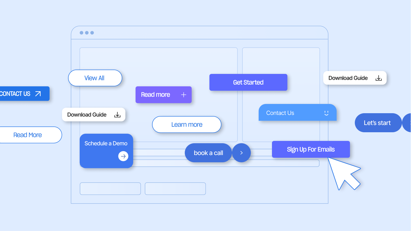
Animations fire before you’ve decided where to look. Tooltips appear before you know what you need. CTAs compete with one another. Personalization changes layouts just enough to make things feel unfamiliar.
The result is not confusion, it’s cognitive fatigue. People don’t feel lost, they feel tired.
UX Fatigue Isn’t About Complexity. It’s About Cognitive Load.
Most modern interfaces are technically usable. They pass audits, they follow patterns, they work. But they demand too much decision-making, too quickly.
Cognitive load increases when:
- Too many options appear at once
- Visual hierarchy is unclear
- Motion distracts instead of guides
- Language tries to be clever instead of clear
This is why users describe experiences as “a lot” or “overwhelming” rather than broken.
As a design agency in NYC, this is the shift we see most often right now. The problem is no longer usability, but restraint.

The Over-Designed Internet
Design culture rewards novelty. New layouts. New interactions. New patterns that stand out on launch day.
But novelty ages fast.
What once felt innovative becomes noise when every site adopts the same techniques. Bento grids everywhere. Kinetic typography everywhere. Scroll-based animations everywhere.
Instead of creating differentiation, over-design flattens experiences. Everything feels loud and nothing feels grounded.
This is where UX fatigue starts to compound. Interfaces stop feeling like tools and start feeling like performances.
Calm UX Is Emerging for a Reason
Across fintech, healthcare, and B2B platforms, there’s a noticeable pivot happening. Not toward minimalism for aesthetics, but toward calm interfaces.
Calm UX prioritizes:
- Fewer decisions per screen
- Predictable interaction patterns
- Slower, more intentional pacing
- Content that explains itself
This is not about removing personality. It’s about removing friction that doesn’t serve the user.
As a website agency working with credibility-driven brands, this shift matters. Calm experiences build trust faster than clever ones.
Trust Is the New UX KPI
Users in 2026 are skeptical by default. They assume automation. They assume tracking. They assume persuasion. What they don’t assume is clarity.
Trust is now built through:
- Straightforward language
- Honest framing of choices
- Interfaces that don’t rush decisions
- Pages that respect attention
When UX tries too hard to convert, it often signals the opposite of confidence. Calm UX says take your time. We’re not hiding anything.
Trust Doesn’t Stop With Humans Anymore
Trust-driven UX decisions now affect more than just human users. They shape how AI systems interpret, summarize, and recommend your brand.
AI models increasingly rely on signals like clarity, structure, consistency, and intent when deciding what sources to surface. Interfaces that are overloaded with competing CTAs, vague messaging, or misleading hierarchy don’t just frustrate users. They confuse machines.
Clear UX supports AI optimization by:
- Making intent unambiguous
- Reducing conflicting signals on a page
- Reinforcing credibility through consistency and restraint
In other words, the same calm, trust-first UX that helps users feel confident also makes it easier for AI systems to understand what your brand stands for and when it should be recommended.
If you want a deeper look at how clarity and credibility factor into AI recommendations, we break it down in 10 Best Ways to Get Your Brand Recommended by AI.
Design Systems Didn’t Cause This, Misusing Them Did
Design systems were meant to reduce friction, not creativity. But many teams now feel trapped by rigid components that prioritize consistency over communication. Everything fits the system, even when it shouldn’t.
This leads to:
- Pages that feel interchangeable
- Layouts that don’t match content intent
- Brand voice diluted by uniformity
The response isn’t abandoning systems. It’s loosening them.
Flexible systems that allow hierarchy, pacing, and narrative to change based on context are becoming essential. Especially for brands that rely on trust and storytelling.
Saying Less Is a UX Skill
One of the hardest things to do in UX right now is remove things. Remove extra CTAs, unnecessary animations, and copy that exists just to fill space. Saying less requires confidence. It assumes the product is strong enough to stand without constant explanation or distraction.
The best interfaces in 2026 aren’t the ones doing the most, but the ones doing the right amount.

What This Means for Teams Right Now
If your product or website feels heavier than it should, the fix probably isn’t a redesign. It’s a reassessment.
Ask yourself:
- Where are we asking users to think too early?
- What could wait until later?
- What motion actually helps orientation?
- What content could be simplified without losing meaning?
As a design agency, these are the questions that matter more than trends.
Where UX Goes Next
UX isn’t regressing, it’s recalibrating. The next wave of great digital experiences won’t be louder, faster, or more impressive on the first scroll. They’ll be easier to live with, to trust, and to return to.
In a landscape full of over-designed interfaces, calm is becoming the differentiator. And for brands willing to embrace clarity over cleverness, that’s a competitive advantage that lasts.
Designing for scrutiny, not just clicks?
We help teams design and structure digital experiences that hold up under real-world use, prioritizing clarity, trust, and performance across complex workflows.
Explore our services or reach out to start a conversation.


