UX design in 2025 is bold, responsive, and deeply intentional. As users demand faster, smarter, and more emotionally attuned interfaces, designers are turning to new patterns and tools that prioritize both clarity and delight.
From modular grid systems to motion-powered text—and now, interfaces built with AI agents in mind—our favorite trends aren’t just stylistic choices. They’re ways to solve real usability challenges in a digital world that never stops moving.
Here’s a look at the UX trends shaping 2025 and how to use them strategically in your next project.
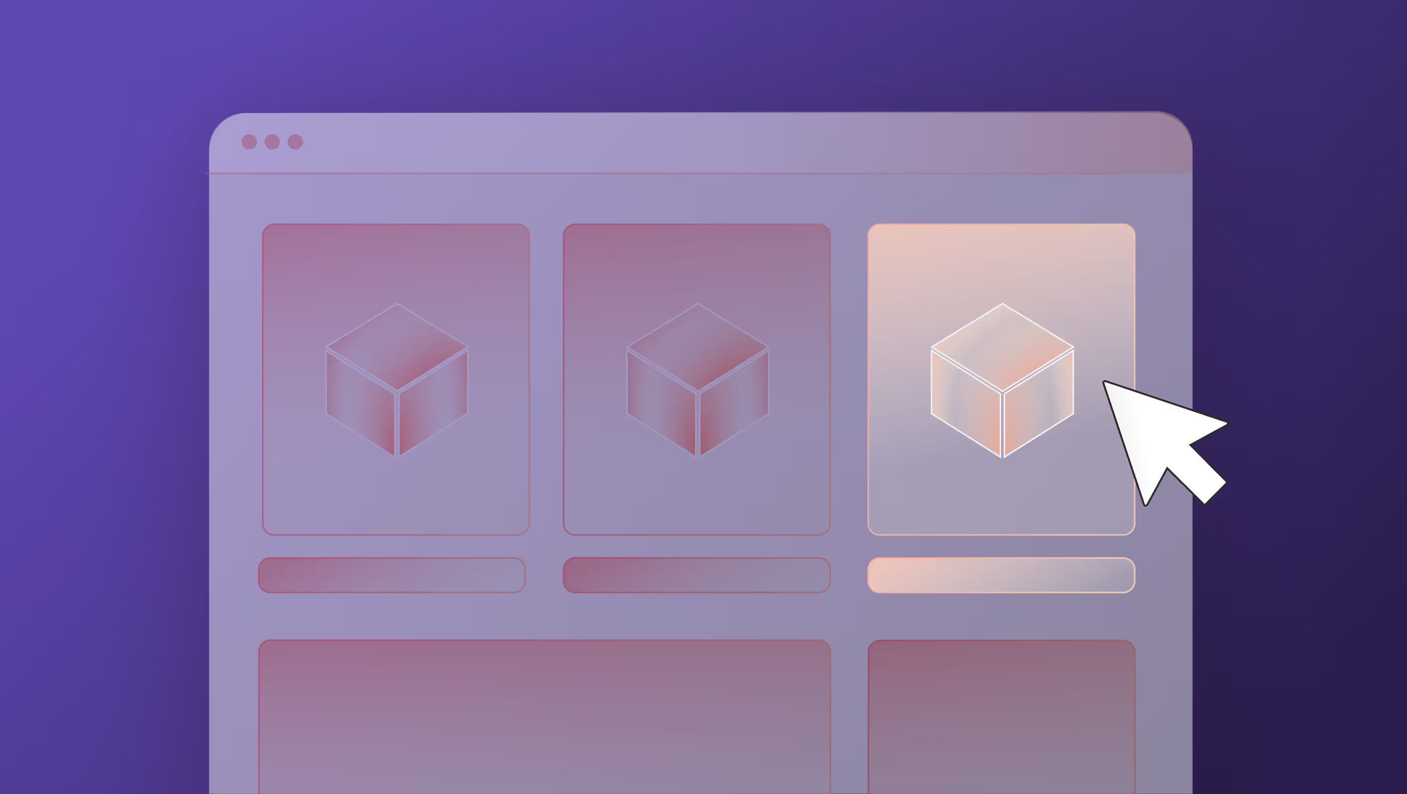
Bento Grid Layouts: Modular Design That Drives Focus
The bento grid layout is everywhere in 2025, and for good reason.
Inspired by Apple’s widget system and the “bento box” philosophy of visual compartmentalization, this layout style divides content into modular blocks with their own purpose, story, or CTA.
Why it works:
- Helps users scan content quickly with bite-sized sections
- Visually balances text, imagery, and interaction
- Naturally encourages hierarchy and movement through the page
- Works well across desktop and mobile
Where to use it:
- SaaS dashboards and analytics pages
Bento grids allow you to break complex data, like KPIs, charts, or notifications, into modular, scannable cards so users can process information without cognitive overload. - Homepages with multiple services or products
Instead of forcing users down a long scroll or hiding content behind tabs, bento grids surface multiple offerings at once, letting visitors explore what’s relevant to them right away. - Portfolio and case study libraries
Each case study or project gets its own visual “tile,” which makes it easy to browse without feeling repetitive. This layout also scales beautifully as your content grows. - Modular blog or article layouts
Want to feature trending posts, editor picks, and categories all in one place? A bento-style layout lets you present multiple content types side-by-side without chaos.
Bento grid layouts pair seamlessly with Webflow’s native grid system and CMS collections. Designers can create dynamic, responsive layouts that adapt across devices—no code required.
Kinetic Typography: Text That Moves (and Converts)
Kinetic typography uses motion, like sliding, fading, scaling, or typing effects, to give text emotion and energy.
You’ve probably seen this on hero sections where bold taglines animate in with rhythm, or on mobile experiences where headlines respond to scroll.
Why it works:
- Captures attention quickly
- Reinforces tone and brand personality
- Creates visual hierarchy and rhythm
- Encourages storytelling in tight spaces
Where to use it:
- Landing pages with a single headline and CTA
Motion can help that hero headline land by drawing attention to your message and guiding the user toward the CTA, especially when there’s not much else on the screen. - Explainer videos or scrolling animations
Animated text reinforces messaging while keeping users visually engaged. It’s especially effective for breaking down complex concepts in a step-by-step, storytelling format. - Presentations and product demos
Kinetic type adds rhythm and pacing, helping you control how and when key points are revealed. It also boosts retention so users remember what moves. - Social-first microsites
These fast, fun sites thrive on motion. Kinetic text adds energy and personality that matches the vibe of campaigns designed for sharing or virality.
Used sparingly, kinetic typography feels modern and polished. Used excessively, it can slow load time or frustrate users, so test carefully. In Webflow, kinetic effects can be triggered by scroll, click, or hover, giving you lots of room to experiment without code.
We love the below example of Kinetic Typography animated by the Ketchum team.
AI-Personalized Interfaces: UX That Adapts in Real Time
AI has moved into the UI. In 2025, personalization is expected—not exceptional. Interfaces are adapting in real time based on user data, behavior, or even time of day.
Why it works:
- Boosts engagement through relevance
- Reduces friction in navigation and decision-making
- Makes interfaces feel tailored and intuitive
Where to use it:
- eCommerce product recommendations
AI can surface relevant products based on browsing behavior, boosting conversion rates without cluttering the UI or overwhelming new users. - Personalized dashboards and onboarding flows
AI can tailor steps, features, or goals based on user roles and past activity, shortening time-to-value. - Smart navigation menus based on past behavior
Think: surfacing the “last visited” or “most used” pages dynamically. This reduces friction and creates a sense of familiarity, especially in SaaS products. - Newsletter signups with dynamic messaging
Tailoring the CTA or copy based on referral source or user behavior can increase opt-ins without changing the core structure of the page.
AI-driven UX is especially powerful when paired with robust analytics and clear visual hierarchy. Tools like Mutiny or Optimizely can enable these features in Webflow via custom embeds or integrations—but aren’t native. Privacy compliance and consent settings are key.
Liquid Glass & Visual Layering: A New Dimension of Depth
Apple’s new design language, Liquid Glass, introduces translucent layering and dynamic depth across iOS, iPadOS, and macOS. It’s already influencing interface design far beyond Apple’s ecosystem—especially in how designers create hierarchy and motion through visual layering.
Instead of hard dividers or drop shadows, this approach uses blur, transparency, and motion to separate content, and guide attention, more fluidly.
Why it works:
- Builds hierarchy through depth, not clutter
- Softens transitions and interactions
- Creates immersive, context-aware navigation
Where to use it:
- Navigation bars and floating headers
Translucent layering creates a sense of continuity while still separating UI from content, keeping the user anchored as they scroll. - Modals and pop-ups
Instead of slapping a box on top of the screen, layered blur and subtle motion make pop-ups feel integrated and intentional, not disruptive. - Mobile interfaces and hover cards
Small screens benefit from spatial hierarchy. Layering lets you hint at what’s beneath or around a menu without fully obscuring it. - Embedded video or media overlays
Blurring the background behind a media player or hover card draws focus without losing context, especially in content-heavy experiences.
In Webflow, these effects can be achieved using background blur, z-index stacking, and scroll-based animations—no custom code required.
Microinteractions 2.0: Tiny Moments, Big Feedback
Microinteractions aren’t new, but in 2025, they’re getting smarter and more emotionally attuned.
Instead of basic hover states, we’re seeing delightfully thoughtful reactions: like a button that pulses after you save, or a tooltip that shimmers when your cursor pauses. Parallax scrolling creates depth and draws the user’s attention to key elements by making the background content move at a different speed than the foreground.
Why it works:
- Reinforces user action and clarity
- Adds personality to otherwise static flows
- Makes interfaces feel responsive and alive
Where to use it:
- Form submissions and progress steps
Subtle confirmation animations (like a checkmark bounce or field glow) reassure users that their action was successful. - Mobile gestures and tap states
Microinteractions create satisfying feedback on taps, swipes, or long presses—critical for touch-first design. - Confirmation messages and tooltips
Add polish by animating in confirmations or guidance when users take key actions, without interrupting their flow. - Audio-reactive animations (especially in apps)
For media or voice apps, microinteractions tied to sound cues (like pulsing waves or beat-synced visuals) create an immersive layer of feedback.
In onboarding flows and dashboards, subtle microinteractions—like a flicker on hover or a gentle bounce on click—help guide users intuitively. It’s the digital equivalent of a nod and a smile.
Animated by the Composite team for Goodwork.
Dark Mode by Default: A Visual Standard, Not an Option
Dark mode isn’t a trend anymore—it’s a user expectation.
With increased awareness of eye strain, device battery life, and aesthetic preference, more websites are treating dark mode as a default view or a system-detected toggle, not an afterthought.
Why it works:
- Reduces visual fatigue (especially on mobile)
- Feels modern and premium
- Helps UI elements pop with contrast
Where to use it:
- Dashboards and productivity apps
Users spend hours here. Dark mode makes their experience more comfortable, especially at night or in a dark space. - Mobile-first experiences
Most operating systems now default to dark mode based on system settings (prefers-color-scheme in CSS). - Media-heavy websites
Dark backgrounds help visuals stand out and feel cinematic. When a site has a lot going on, this can help the user see what’s important by creating contrast. - Developer tools and tech platforms
This audience often prefers low-glare interfaces and expects a dark theme by default.
In Webflow, dark mode can be built using custom CSS or toggled via JavaScript and system preferences. Just make sure you test your color contrasts—it’s not just about black and white.
Agentic AI: Designing for Interfaces That Act Without You
Agentic AI is changing how we think about user experience. Unlike traditional AI tools that respond when prompted, agentic AI can set goals, make decisions, and take action—without waiting for a user to click.
That shift has major implications for UX. You're no longer just designing for a human user, you’re designing for a system that behaves like a user, too.
Why it works:
- Cuts down on user friction by letting the AI handle multi-step tasks
- Opens the door for goal-driven flows (“Get me more leads,” “Summarize this dashboard”)
- Allows experiences to adapt in real time based on outcomes, not just behavior
Where to use it and why:
- Marketing tools and CRMs
Agentic AI can run full campaigns, test copy variations, and optimize performance—without constant human input. UX needs to reflect what the AI is doing, not just what the human asked for. - Customer support interfaces
Instead of just chatting, agentic systems can pull account data, draft responses, and trigger back-end actions. Designers need to balance transparency with automation. - Productivity tools and dashboards
AI agents that schedule tasks or summarize meetings change how users navigate information. Interfaces should surface intent and outcomes, not just data.
Closing Thoughts: What to Try First
You don’t need to implement all of these trends tomorrow, but each one offers a way to improve UX in thoughtful, user-driven ways.
Start with the trend that aligns most with your goals:
- Want better scanability? Try a bento layout.
- Need higher engagement? Explore kinetic typography or microinteractions.
- Looking to future-proof your UI? Think about AI personalization, liquid layering, or even agentic AI.
UX isn’t just about looking modern. It’s about building experiences that feel intuitive, intentional, and human—even when the “user” might be an AI system.
And if you want a UX strategy that moves with your users, not against them, let’s build it together.